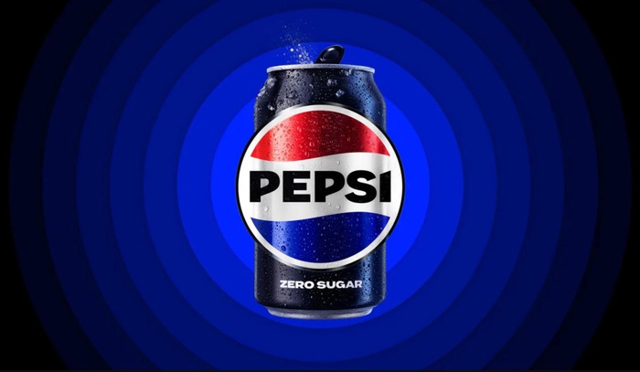
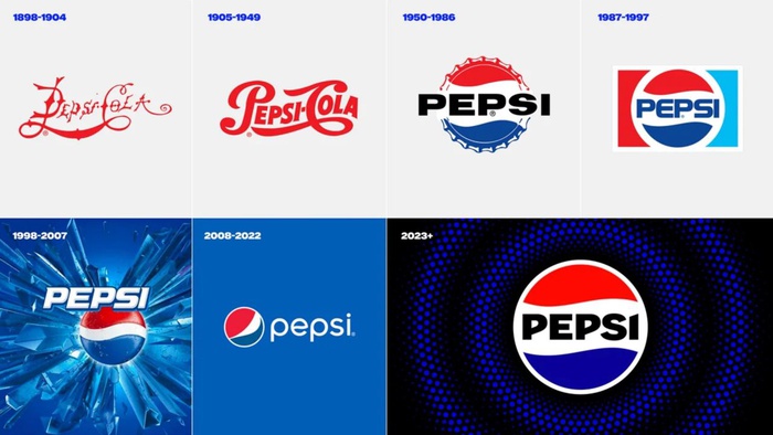
Pepsi has updated its logo for the first time in 15 years, the new design will be used in North America in the fall of 2023 and by 2024 it will be seen around the world, the company said in a press release.
The company has been using the previous logo since 2008. The changes are timed to coincide with the brand’s 125th anniversary.
Now the inscription on the logo is located in the middle of the red, white and blue circle. The main color is not bright blue, but black and dark blue. The company uses the same colors in the Pepsi Zero Sugar line, so Pepsi is trying to draw attention to the fight against sugar consumption.
The drink cans are said to have a “new visually distinct silhouette” and the font has also been changed.
According to CNN, Pepsi last changed the logo in 2008, but it’s been “a bit dated” ever since. “This lowercase italic font, the blue is a little off…it doesn’t exude the confidence and energy that the brand really represents,” Pepsi chief marketing officer Todd Kaplan explained of the changes.
Author:
anastasia mariana
Source: RB
I am a professional journalist and content creator with extensive experience writing for news websites. I currently work as an author at Gadget Onus, where I specialize in covering hot news topics. My written pieces have been published on some of the biggest media outlets around the world, including The Guardian and BBC News.


