


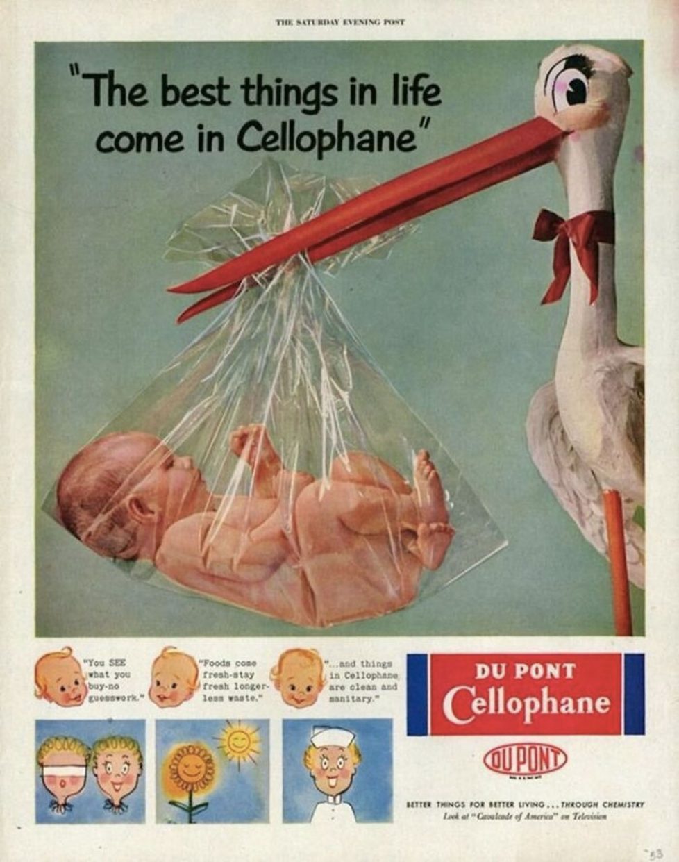
Old ads always seem weird, creepy, or comical.
Recently I came across a selection of posters from the last century from Western brands and decided to compare them with the theme of how the same companies are promoting their products now.
The difference in creativity and technical capabilities surprised me so much that I came further and brought together a dozen Russian companies that survived the collapse of the Union.
The ad they released 70 years ago looks good in some places, pathetic in others, but there are phenomenal examples.
Below I propose to compare how their posters have changed. At the same time, we value evolution and our own things.
Russian companies have reached a new level. But not all
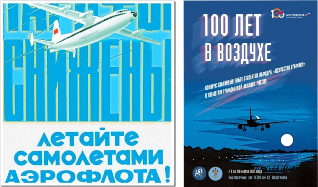
Aeroflot. In 2023, he turned 100 years old.

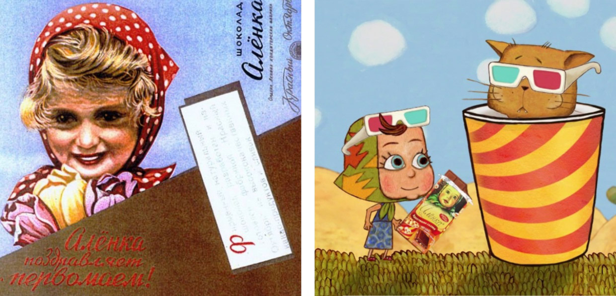
Chocolate “Alenka”. Postcards were popular.
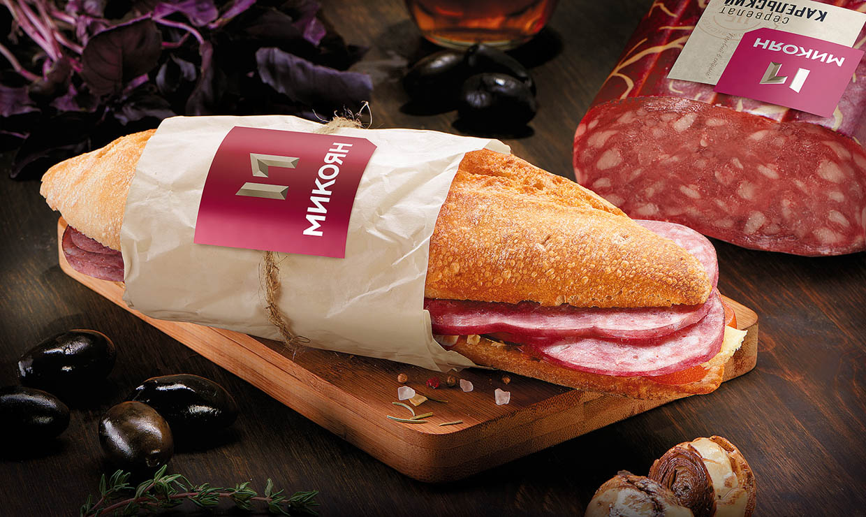
The Mikoyan company claims that it began back in 1978, and after the revolution he became a people’s commissar.
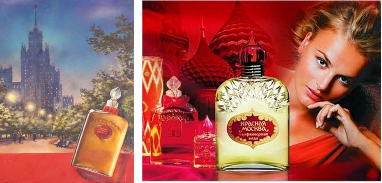
Perfume “Red Moscow”. It was atmospheric!

The Pobeda watch has moved away from brutalism and is now positioned as a “light” accessory.
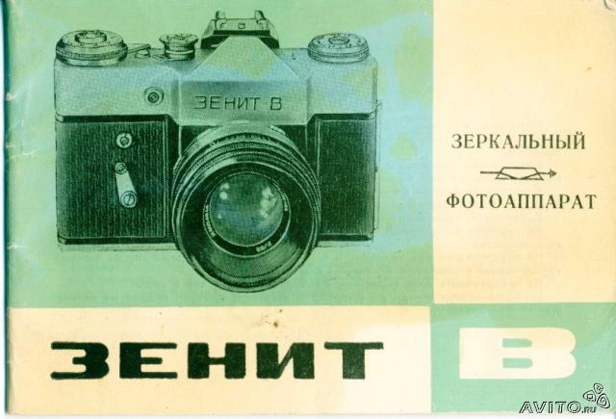

But Zenit carried out an aggressive rebranding. It got a lot better
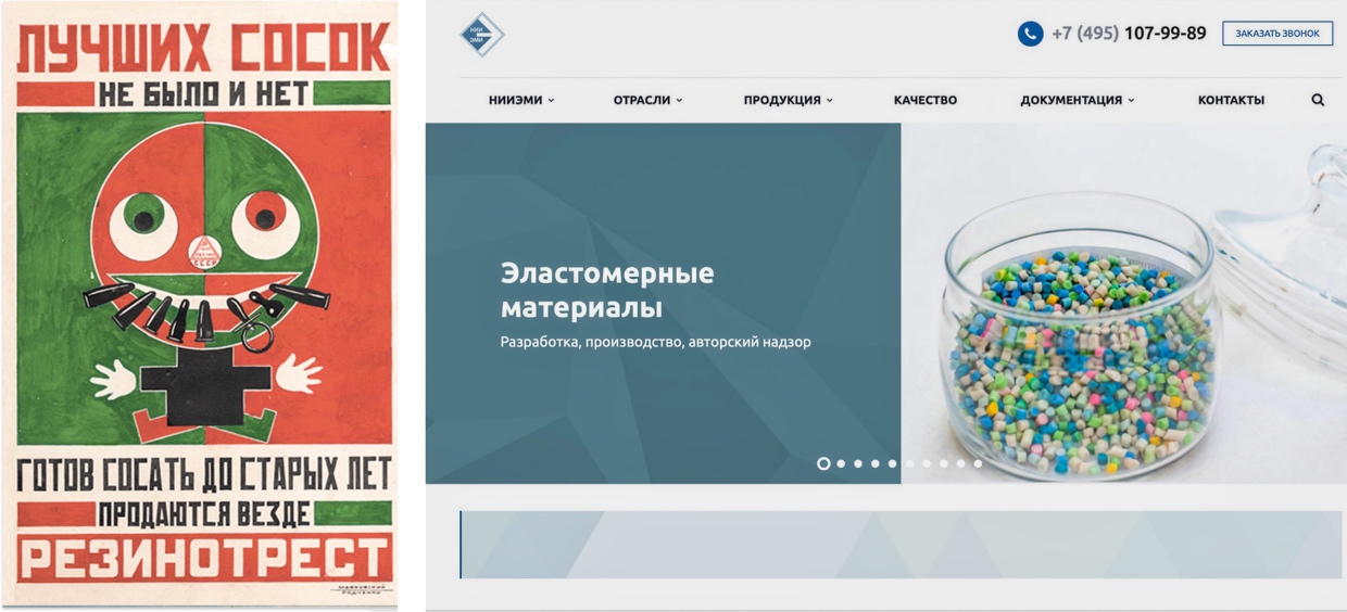
The institute, famous for Rezintorest, for which Rodchenko and Mayakovsky made a poster, is still working


Sber Impresses the Evolution of Advertising
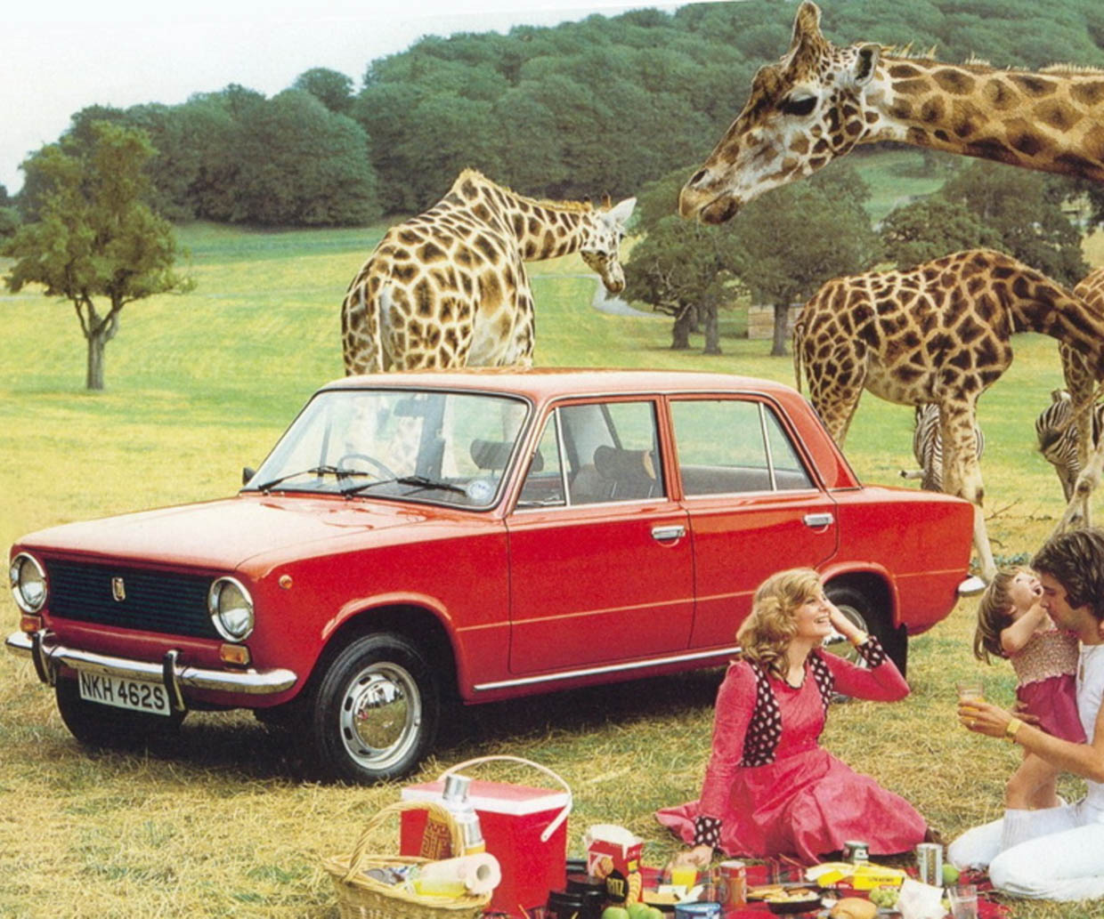

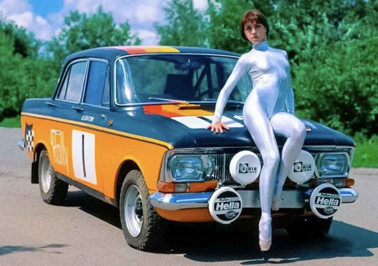

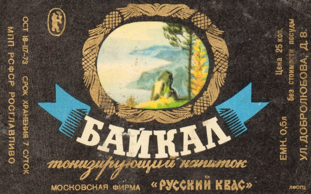
Soviet-Russian brands continue almost a century old business. Almost all of them have remained the same organizations that they were. At least the energy source is the same in many cases. Sberbank remained a bank, Lada and Moskvich cars, Baikal drink.
But the old ads have more character. Only the largest players work at the same level and make technological progress. The rest seem to have gone into the shadows and work by inertia, take, for example, the Pobeda watch or the former Rezinotrest.
But Western brands also left a great legacy. Now let’s show even more friends.
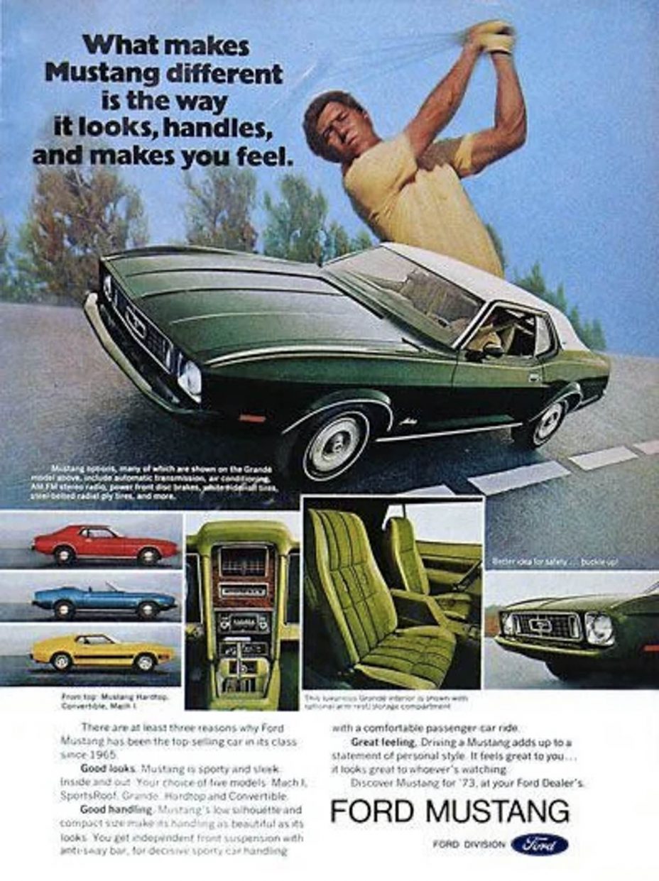
Some US and European companies are visually “tired”. Other steel masterpieces
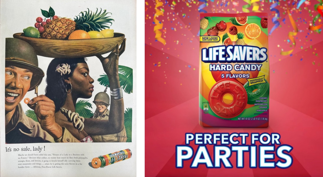
Life Savers candies were promoted by the best creative posters, and now they look lurid.

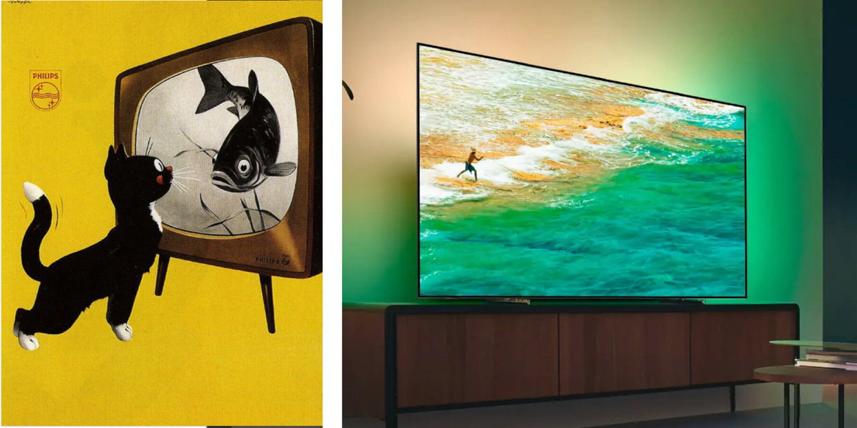
Phillips made it easy


But some people keep on setting the trends
So, as you can see, it has changed a lot. Phillips couldn’t show what a flashy TV they were doing, so realism was hinted at through a cat who is sure the print sees a fish.
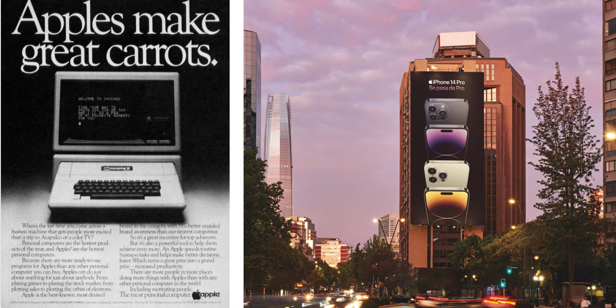
But Apple has been in the same style for more than forty years. In the center of the product and a large header. And everything else goes in the background.
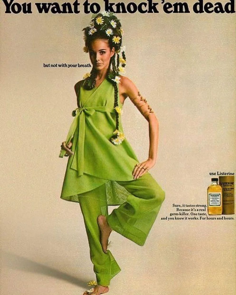
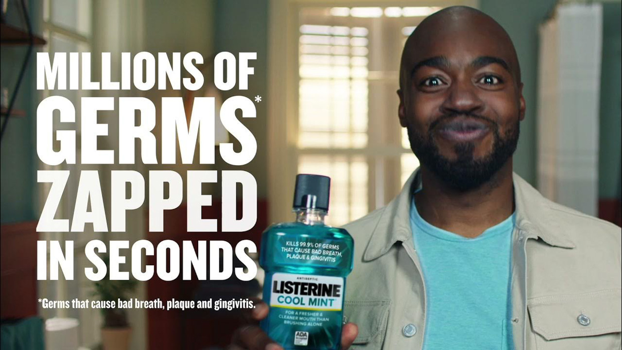
What terrified me the most was Listerine’s pressure. If earlier the company just hinted at your bad breath, now it says directly: you have millions of dead in your mouth that urgently need to be exterminated!
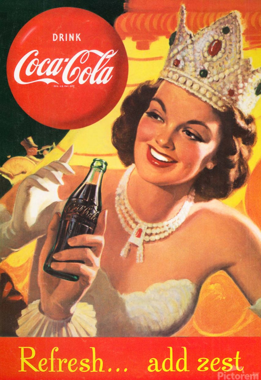
Coca‑Cola also excelled. She moved away from using pin-up women to draw attention and emphasized the technical execution of her ads. And it looks like they are succeeding.
Source: Iphones RU
I am a professional journalist and content creator with extensive experience writing for news websites. I currently work as an author at Gadget Onus, where I specialize in covering hot news topics. My written pieces have been published on some of the biggest media outlets around the world, including The Guardian and BBC News.

: Everything we know a week after its release")


