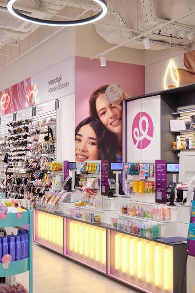
The Podruzhka retail chain of cosmetic stores has changed its name: the company has changed its slogan, logo, typography and color palette. This was reported to RB.RU by a representative of Podruzhka.
Join
The company clarified that it carried out a rebranding because “the semantic and visual components of the brand began to become obsolete and stopped reflecting the brand’s main philosophy and mission.”
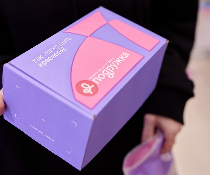
In the updated logo, the style has changed to “friendly grotesque”: the bow has been transformed into a circle with a plastic ribbon and two loops, symbolizing beauty and lightness.
The traditional description of “Cosmetics chain store” was replaced by “beauty – care – mood”. The new motto was the phrase “It’s so easy to be beautiful.”
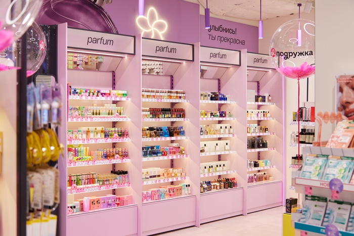
The brand’s communications now focus on beauty categories. The changes were also reflected in the new visual image: active and dynamic graphics appeared from start to finish, the corporate font was updated and a softer color palette was introduced.
In addition to the main color pink, the brand will now use signature colors such as blue, yellow and green.
In March, the first Podruzhka store of the new retail concept was opened in the capital in the Aventura shopping center.
Author:
Anastasia Marina
Source: RB
I am a professional journalist and content creator with extensive experience writing for news websites. I currently work as an author at Gadget Onus, where I specialize in covering hot news topics. My written pieces have been published on some of the biggest media outlets around the world, including The Guardian and BBC News.


