


There is a good rule: do not touch what works fine. Apple forgot about it, and here is the result.
iOS 18 has a major update to the app Photo – the only built-in way to interact with photos on your iPhone and your entire media library, videos, and screenshots in iCloud at the same time. There have been very few complaints about it so far, but I would like a more convenient cataloging.
Here’s the main thing: 42 new features of iOS 18
In response, Apple went somewhere, no one asked it to go: it turned the application into something between a social media feed and an AI designer’s concept – with non-obvious algorithms, hundreds of tabs, different submenus and unclear settings settings.
I’ve been installing and occasionally reviewing iOS betas for over 13 years, and I don’t remember That’s why an aggressive, controversial change to a key application.
Now that everyone can install the iOS 18 public beta, I want to ask. After all, I’m the only one who is bothered by the update Photowhich has now become much more difficult to understand and no easier to find anything?
What’s wrong with the Photos app
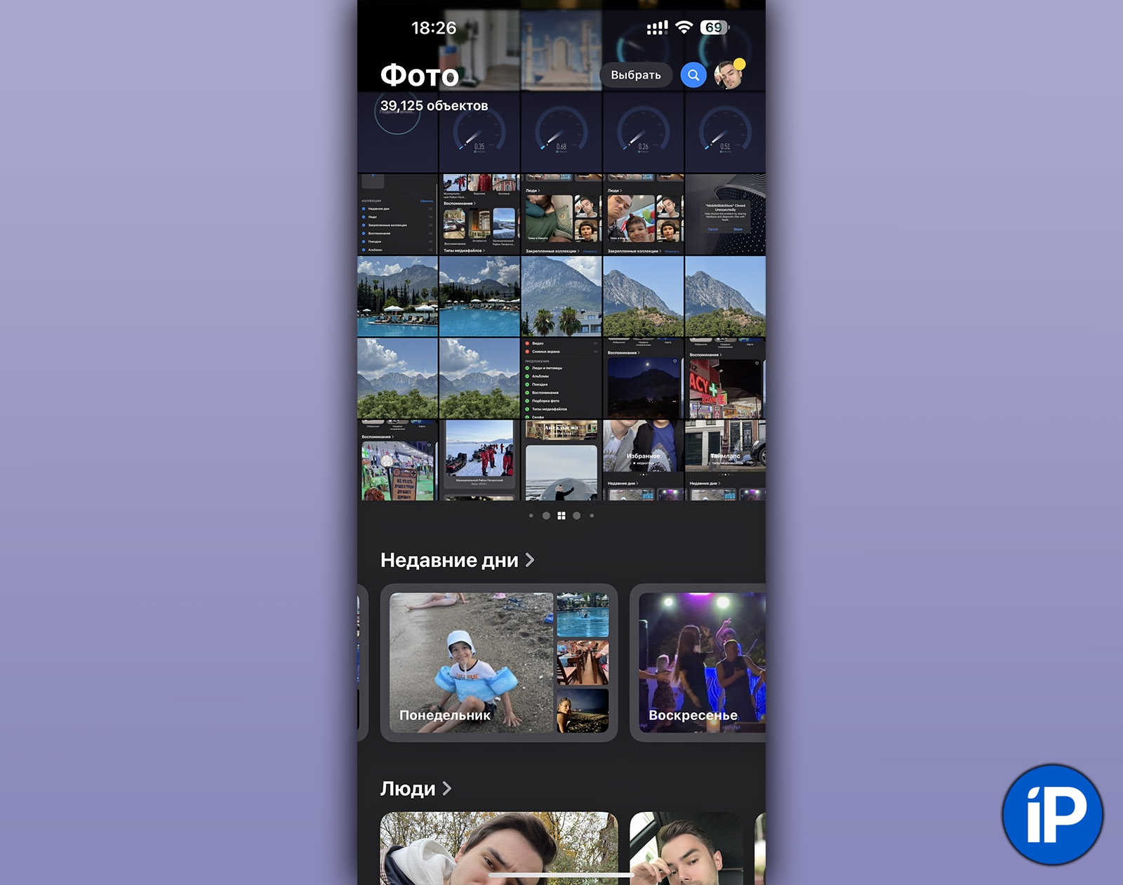
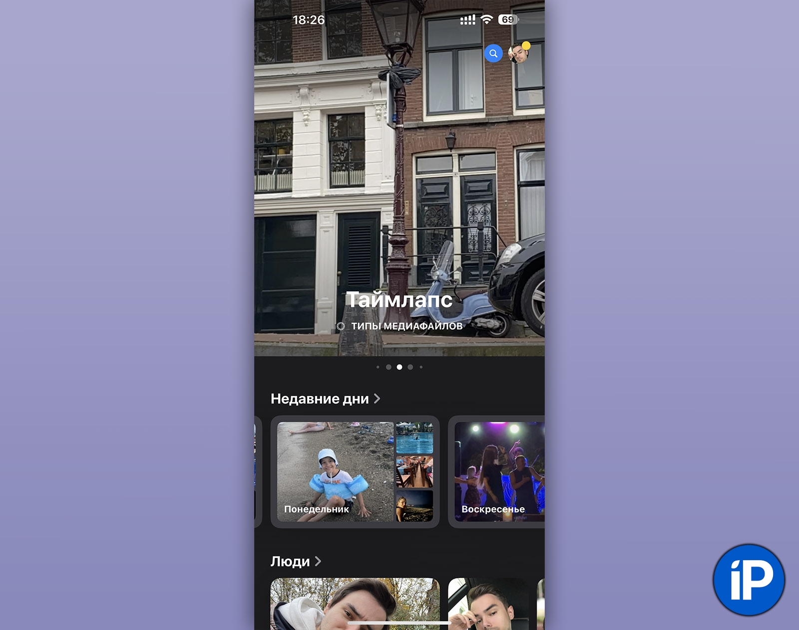
The new home screen for the Photos app in iOS 18. On the surface, everything looks pretty normal.
Application Photo changed smoothly over the years. Despite the advent of albums, tabs, sections and neuro-«Memories“, the idea of displaying a full feed of all images on the pristine kitchen of the home screen. If you last used an iPhone 10 years ago, then Photos from iOS 17 would be easy to figure out in less than a minute.
What happened to photos in iOS 18? In simple terms: Apple has broken away from the divider ribbon on tabs, like Recentcombining all of this into one, highly customizable feed. Now it has everything: all your albums, all Memoriesall sections, videos and so on.
Sounds good? It even looks interesting in the picture. Until you start using it.
There are a lot of sections, their content is not intuitive.
▸ Reload sections. Sections are available under the top photo feed. By default, everything is enabled there, that is:
▪ recent days
▪ people
▪ supplemented collections
▪ memories
▪ trip
▪ albums
▪ shared albums
▪ photo selection
▪ media file types
▪ other
▪ wallpaper offers
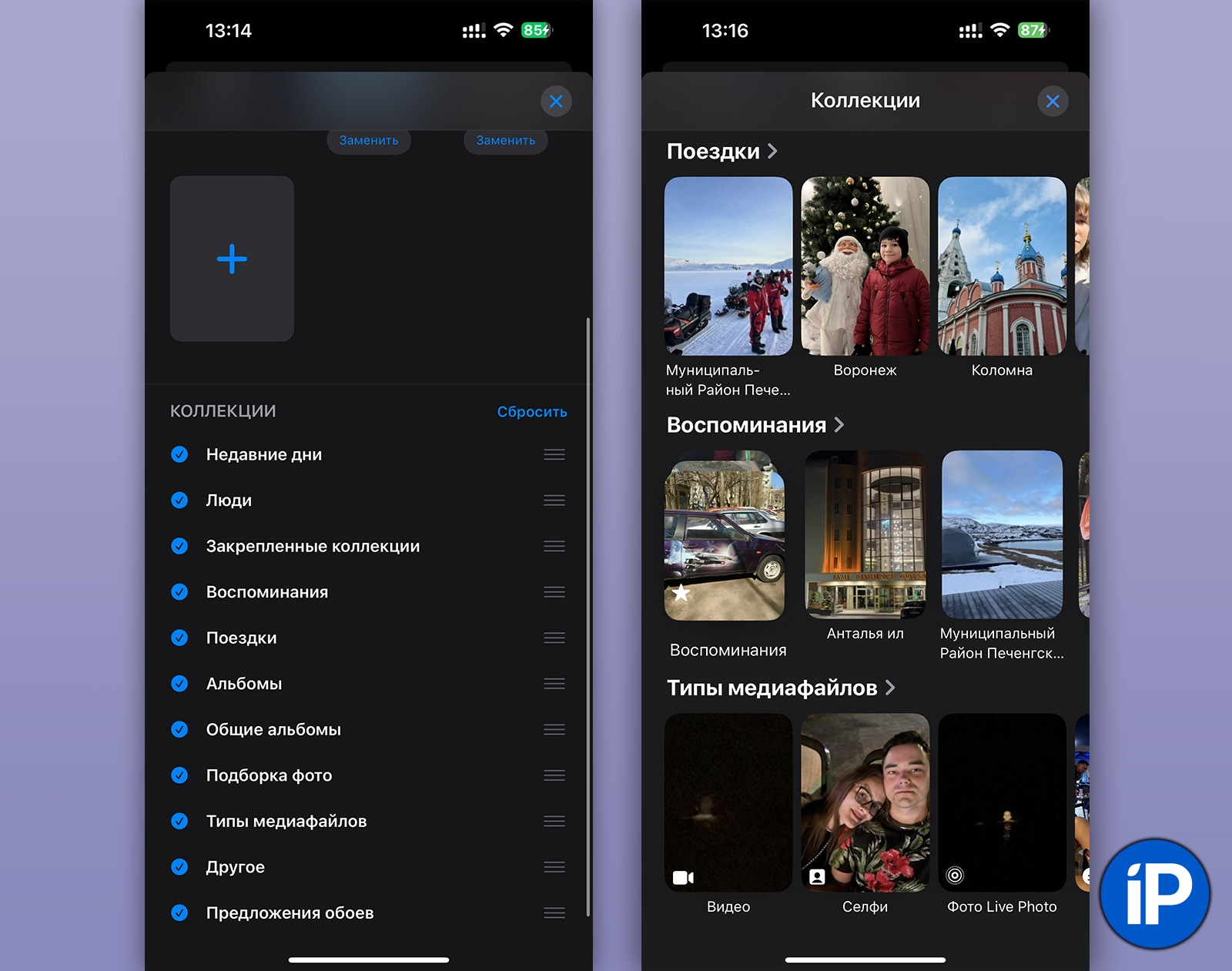
It takes a long time to scroll to the very end, and even longer to find what you need from this point. It’s good that you can remove unnecessary ones if you reach the end and click on Tune.
Subsections Pinned collections You can duplicate each other and even display the same photo.
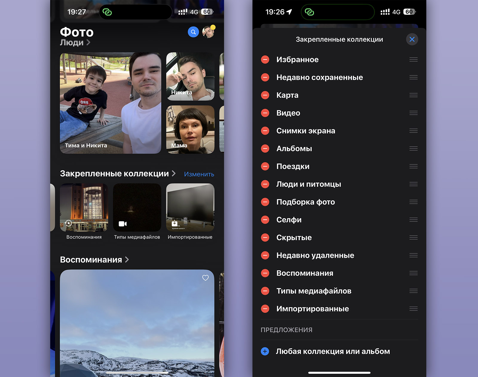
▸ The sections contain who knows what. The names of each item in the sections themselves are not very clear. What is Othercan you guess? Drum roll…
These are hidden photos, duplicates, recently deleted photos, and departments. Checks And DocumentsIt’s not intuitive, you have to remember all this somehow.
What about Pinned collections? Here you can add the same sections that are already in the main list page, as well as additional ones that for some reason cannot be installed from this table. Yes, you can duplicate (why?).
Also to this addition, in the section Memories special selections of photos of people and events. And in the section Trips – just a case. At the same time, both sections can be moved to the main page for some reason, so that their content is repeated by each other in the feed. My head is spinning.
▸ Each section has different internal pages.. Superficially, the idea here is clear: the interface inside the section is made according to the filling of this section. For example, if you open Tripsthen at the top in the bookmarks you can select a specific year, and in the large cards that scroll vertically – find a selection of photos with the indication of “trip”. If you have a lot of trips, get ready to scroll heartily.
At the same time, Memories there is no sensible filtering. And People a completely different interface altogether. In short, each screen looks different from the previous one or the similar one in the adjacent section.
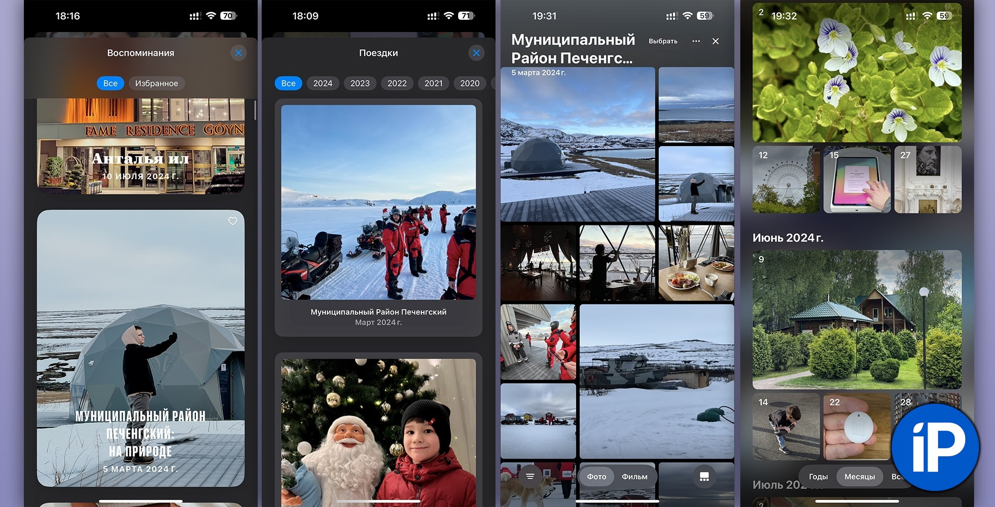
The interface is different everywhere.
▸ 100500 different interfaces. Just look at the screenshots above. A cross here and there. Some sections and departments can be closed by swiping down, others cannot. Some have buttons on the surface of the photos, some don’t. Some are presented as a collage, some are not…
This is not a single language interface, but a dump of ideas, united by absolutely anything. As if the designer had the task of showing the maximum amount of content presented within the program, and it did not matter how the user would learn all this.
▸ Photos flash before my eyes. Each section, scrolling horizontally, holds at least 5 photos, often several are blocked at once. They are not static, they change almost every second. There can be up to five such slideshows on one screen at once.
As soon as you start scrolling, a disco of constantly changing photos begins before your eyes. Not only does it look terrible, but look, you don’t even understand some of them, they are replaced so quickly by the next photo. It is unclear for what purpose this flickering is done, except for visualization for Apple presentations. There is no benefit for the user at all.
Three swipes to the side, and the feed of all photos disappeared from the main page completely.
▸ They ruined the most important thing – the feed of all photos. If you don’t scroll down and drown in a soup of 125 incompatible designer ideas, it might even seem that everything is fine. The main feed of all the images in the device’s memory and iCloud is still available. But if you suddenly swipe sideways on it in Nurgali, then Carousel.
In tabs-cards Carousels you can install any type of content from your entire Photo library. By default, there is a lot of it, this is harmful on the last tab-card. And if you swipe to the side several times, including by accident, then you will not see a large feed of all photos. To find it, you will need to swipe a random number of times until you get to it again.
I’m sure that your parents or relatives will ask you, as the main “techie” among relatives, more than once: “Where are all my photos?” And another 125 questions, the answer to which will be difficult to explain remotely. Well, that is if Apple does not change the application again by the release.
By the way, I have repeatedly encountered a bug due to which new photos or screenshots are not presented in the feed. And for some reason, there are no images saved from messengers or the browser. For them, you need to go to the section Recently savedwhich is located in Collections. Intuitively? Of course not. That’s brutal.
The Photos app has become a garbage dump
You can fix crashes, but the logic is more difficult.
Apple’s motive for massive modernization Photo and I allow users to change a lot of things there that I understand. But what it turned into Photo now, nothing but a failure and a dump can be called. Not only is there no understanding and comprehensibility of iOS, which is falling every year – everything has become much worse here than in any version of Android.
To the user from the application Photo no need for “bells and whistles” and “frills”. The user comes to quickly show or view the photos themselves, find a specific image or share it in another application, and also transfer it in another way. That’s it. It was necessary to simplify this task, and not to overwhelm the official institution with 125 cross-type catalogings.
I really hope that Apple will put users first and postpone the release of the updated Photo app until late autumn to find a unified and understandable logic for its operation. And I really doubt that Cupertino will be able to sort out this set of logical ideas that are incompatible with each other just a month and a half before the September release of iOS 18.
Almost everything needs to be redone here, and also work on stability, since I constantly see crashes from the media library to the desktop. It is almost useless to clean up anything here. It is necessary to throw out everything and start from scratch, where zero is what users really needed from the photo and video storage program. And not what was easier to sell through presentations or just to Apple’s “top” project security managers.
Source: Iphones RU
I am a professional journalist and content creator with extensive experience writing for news websites. I currently work as an author at Gadget Onus, where I specialize in covering hot news topics. My written pieces have been published on some of the biggest media outlets around the world, including The Guardian and BBC News.
: Everything we know a week after its release")


