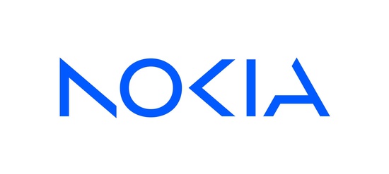
In a speech on the eve of the Mobile World Congress (MWC) in Barcelona, Nokia announced a new corporate and technology strategy. As part of the first changes, an updated company logo was introduced.
Pekka Lundmark, who took over as CEO of Nokia in 2020, developed a three-step strategy: restart, accelerate and scale. According to the senior manager, the first stage is complete and the corporation has moved on to the second.
The updated business strategy, according to the company, will focus on acceleration in six areas:
-
Increase the market share of service providers through continued technological leadership.
-
Increase the participation of the company in the portfolio of its clients.
-
Continue to actively manage its portfolio to ensure that the company has a leadership position in all segments in which it chooses to compete.
-
Leverage opportunities in non-mobile sectors to monetize Nokia’s intellectual property and continue to invest in research and development for Nokia Technologies.
-
Implementation of new business models such as as-a-Service.
-
Turn ESG into a competitive advantage and become the “option of choice” in the industry.
To achieve these objectives, the company will focus on four factors:
-
Development of promising talents;
-
Long-term research investment, especially in areas like 6G;
-
Automation of operations;
-
Brand update.
“Today, we share an updated business and technology strategy with a focus on unlocking the exponential potential of networking, creating a future where network meets cloud.
To express this ambition, we are updating our brand to reflect who we are today: a leader in B2B innovation. This is Nokia, but not as the world has seen us before,” said Lundmark.
Photo: Nokia
The new Nokia logo consists of five different shapes that make up the company name. The Telecommunications Corporation has ditched its signature blue font. Logo color now changes based on usage.
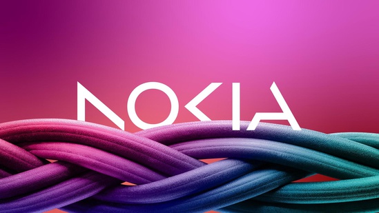
Photo: Nokia
“The company’s new logo symbolizes the vibrant, dynamic and modern Nokia, demonstrating its values and purpose,” the statement said.
Nokia’s move to automate manufacturing and data centers will pit it against tech giants such as Microsoft and Amazon, Reuters said.
“There will be many different types of deals: sometimes they will be our partners, sometimes they may be our customers and I’m sure there will also be situations where they will become our competitors,” Lundmark said in an interview with the publication.
Cover photo: Konektus Photo / Shutterstock
Author:
Ahmed Sadulayev
Source: RB
I am a professional journalist and content creator with extensive experience writing for news websites. I currently work as an author at Gadget Onus, where I specialize in covering hot news topics. My written pieces have been published on some of the biggest media outlets around the world, including The Guardian and BBC News.


