


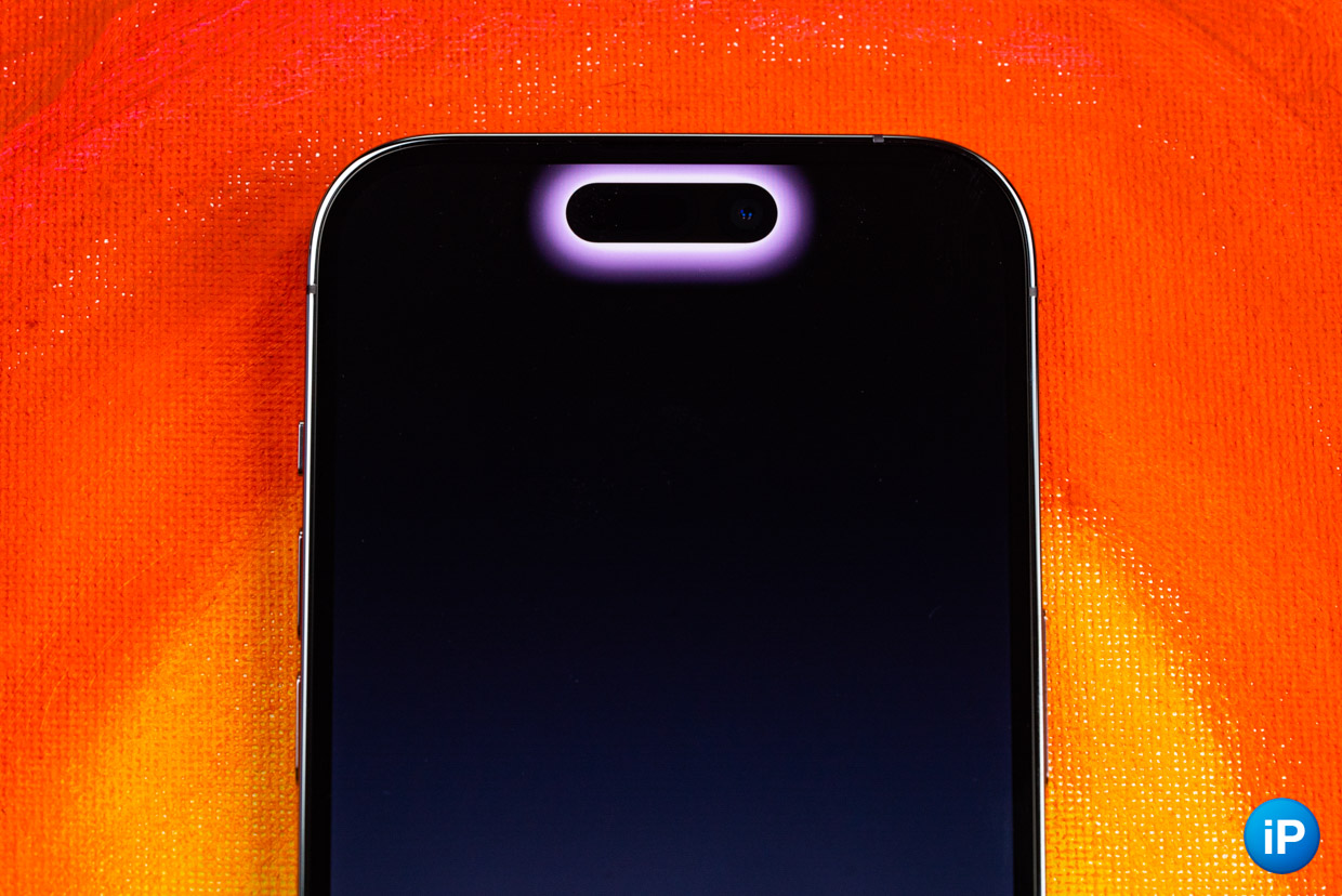
One of the main innovations of the iPhone 14 Pro is the Dynamic Island notch. It completely changes in this area.
Now you can interact with her. This is no longer an empty area in which cameras are simply concentrated, but a full-fledged functional part of the display.
I’ll be honest. I was skeptical about Dynamic Island. On the one hand, the innovation looks intriguing and really something unusual. On the other hand, I strongly doubted that after a while I would really actively use this cutout.
Now six months have passed since the purchase of the smartphone. You can also make some selections.
Pros Dynamic Island
Dynamic Island is a reimagined cutout in the screen that displays various information. This solution has its advantages and disadvantages. Let’s start with the positives:
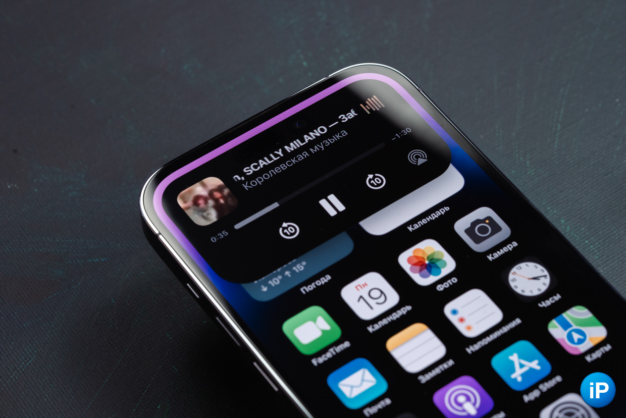
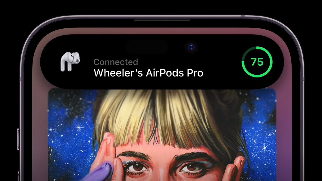
✅ it is convenient to use the music player with it
✅ on it you can change the status of orders in stores (it is especially convenient to track taxis in Yandex Go and couriers in Yandex Lavka)
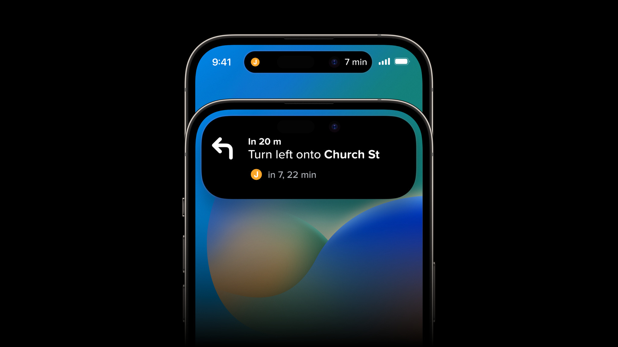
✅ it is easy to navigate; you can keep track of where you are going without opening the map
✅ help information now does not take up the entire screen; for example, the message about the low battery of the iPhone is now covered with a thin line, and not pressed on the screen; is shown when the silent mode is switched, accessories with their own animation are connected, the operating mode changes, the mini-remote for Apple TV works, etc.
✅ it is possible to quickly open an active application (or some necessary one if you install a special program) so as not to multitask
Cons of Dynamic Island
But not everything is as rosy as the results may be at first glance. There are disadvantages of some clippings, and of them banks were found to be critical for someone:
❌ there are still very few apps that appear on the new screen
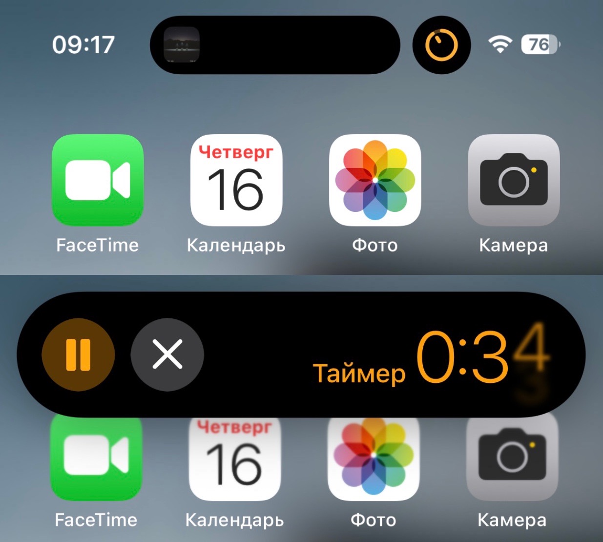
❌ the timer in Dynamic Island is displayed, but for some reason the stopwatch is not; I sincerely do not understand what prevented him from being placed there too
❌ some apps’ data updates via the Live Activity API often don’t happen in real time,
❌ many applications simply disappear from Dynamic Island for no obvious reason, they simply do not appear and that’s it, although they were found in it several times
❌ constantly reaching for the cutout to perform certain actions, over time it tires, this functional area is revealed too high
❌ the normal call mode is also not thought out to the end; I sincerely don’t understand why it was impossible to add more hotkeys, for example, quickly mute the microphone (this feature is available when calling FaceTime)
Does Dynamic Island really get in the way?
It’s really all very subjective. To me personally he no more than the last “bangs”.
It covers part of the screen area, but is not very striking. Even when watching a video, I forget about it in just 10 seconds. It’s like he doesn’t even exist. Especially do not care about the cutout during dark scenes, where it is even more camouflaged.
In games, this is a little more difficult. If they are not optimized for Dynamic Island, then it will overlap the elements of the facade. Still, the notch “went down” a little.
However, in most cases, it did not interfere at all. And if the notch on the screen annoyed you before, then it will be felt now – no more, no less.
Is there any real benefit from it or is it just a toy
Frankly, even now it is difficult to evaluate this innovation. I don’t use the notch very often.
The only thing I really actively use is the player mode. In the near future with control center, this area will automatically close when I switch tracks when I close the display area. This saves one action.
Other options I often bring up when the screen can be blocked. The same timer is displayed on the locked display, and all other operations implemented through the Live Activity, too. This part duplicates what should be shown in the cutout. Well, then why do I need it? I won’t put my mind to it.
If anything, I’m talking about things that in some cases I don’t need. Information about various information cards, such as Yandex Stores, Uber or information about flights or football matches.
Now it’s more of a toy than a really useful thing.
So far, the innovation is more like the Touch Bar in the MacBook. But he needs time. Everything may change in the future.
Source: Iphones RU
I am a professional journalist and content creator with extensive experience writing for news websites. I currently work as an author at Gadget Onus, where I specialize in covering hot news topics. My written pieces have been published on some of the biggest media outlets around the world, including The Guardian and BBC News.
: Everything we know a week after its release")


