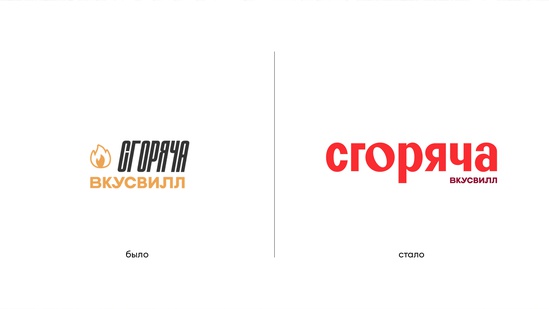
“Vkusvill” carried out a large-scale rebranding of the “Rash” service. The retailer has updated the visual style, positioning, tagline, and more. The visual style was developed by the LINII team and the art director of Vkusvilla.
The Swiftness project has been running since 2021, when the kitchen menu consisted of about 20 dishes. The company did not think about the visual style at the time, the press service said.
By the end of 2022, the revenue of the Vkusvila “dark kitchen” service increased more than five times. And the total number of dark kitchen services has doubled to 70 across the country. The service seriously expanded the menu, began to offer rolls.
“In the new stage, we needed additional images to meet the growing demands of the project. And a design that reflects our brilliance, boldness in synergy with Vkusvill’s values: quality, pure ingredients and included relationships. These became the prerequisites for the rebranding, ”explains Sergei Pavlov, Rush project leader.
archetype
The company also discussed a new service archetype that differs from the core brand positioning. “Explorer” is chosen as an archetype, it opens up new things through diversity. The concept implies frequent changes in the assortment and regular refinement of dishes. 10-15 new offers appear on the menu every month.
The archetype formed the basis of the rebranding. The LINII team developed the logo, tagline, fonts, and identity for various channels and media. The main idea is variety.
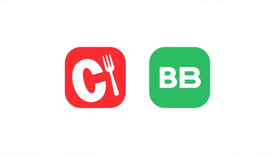
In addition to the main logo, the abbreviation “C” will appear on a daily basis, this is how the icon of the application and social networks will be seen.
Dishes have become the face of individual elements of corporate identity. In banners, they form a composition similar to a slider in a social media feed.
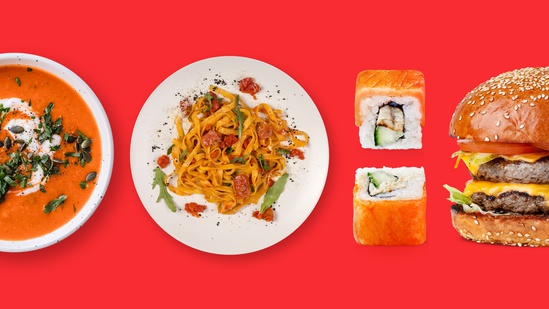
The company has revised the approach to menu item photography for the catalog and advertising. The angle and colors have changed, as well as a single style. Now the catalog will have more photos of dishes taken from above.
Color
Red has become the corporate color of “Rush”, it corresponds to the idea of \u200b\u200bbright taste impressions and novelty. Also, beige, yellow and burgundy can be used.
Motto
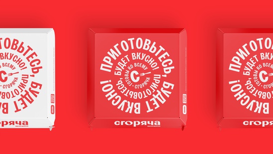
“Ready for Anything” reflects the service’s readiness for any challenge. A new slogan will also appear on packages and packaging: “Get ready, it will be delicious.”
The project operates in major Russian cities: Moscow, St. Petersburg, Kazan, Samara, Rostov-on-Don, Nizhny Novgorod, Tula, Cheboksary, Kaluga, Volgograd, Orel, Bryansk, and Tambov.
Author:
Natalia Gormaleva
Source: RB
I am a professional journalist and content creator with extensive experience writing for news websites. I currently work as an author at Gadget Onus, where I specialize in covering hot news topics. My written pieces have been published on some of the biggest media outlets around the world, including The Guardian and BBC News.


