


From its initial launch earlier this year, the new interface e-mail has been available to users of gmail on an opt-in basis, but now for a large group of account holders (excluding Google Workspace Essentials customers), the new design is rolling out automatically. Pending general complaints from the public using the service, Google is allowing people to revert to the old design for nowbut the ambition is clearly to move all users to the updated UI soon enough.
Meet Gmail’s new interface, complete with a sidebar to switch between your inbox and other Google apps.
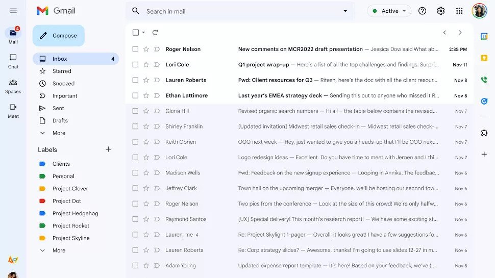
Announced in early February, the new Gmail interface is designed to bring all of Google’s communications services together in one place, minimizing the need to switch between tabs when using the company’s offered services. With the new system, a panel on the left side of the email client allows users to quickly navigate between Gmail, Chat, Spaces and Meet, and depending on the services available under their respective Google Workspace subscriptions, users can select which of these apps to view.
Here are Google’s words about it:
When enabled, the new navigation menu allows you to easily switch between your inbox and important conversations and join meetings without having to switch tabs or open a new window. We hope this new experience makes it easier for you to stay on top of what’s important and get the job done faster in one focused location.
The company is also eager to let people know that the Material You design language underlying the new interface has been used, which is said to give a “fresh look” to the various interconnected applications. The aesthetic is characterized by a soft color palette and rounded edges, in line with the direction Google is taking for the Android user interface.
Source: Lega Nerd


: Everything we know a week after its release")


