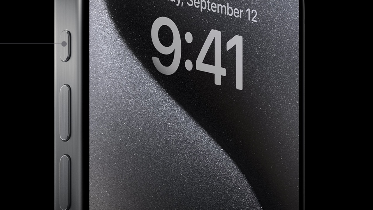
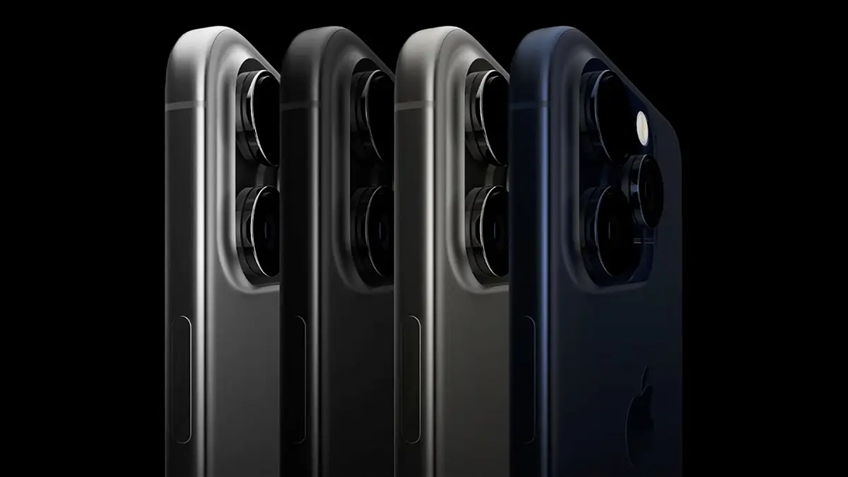
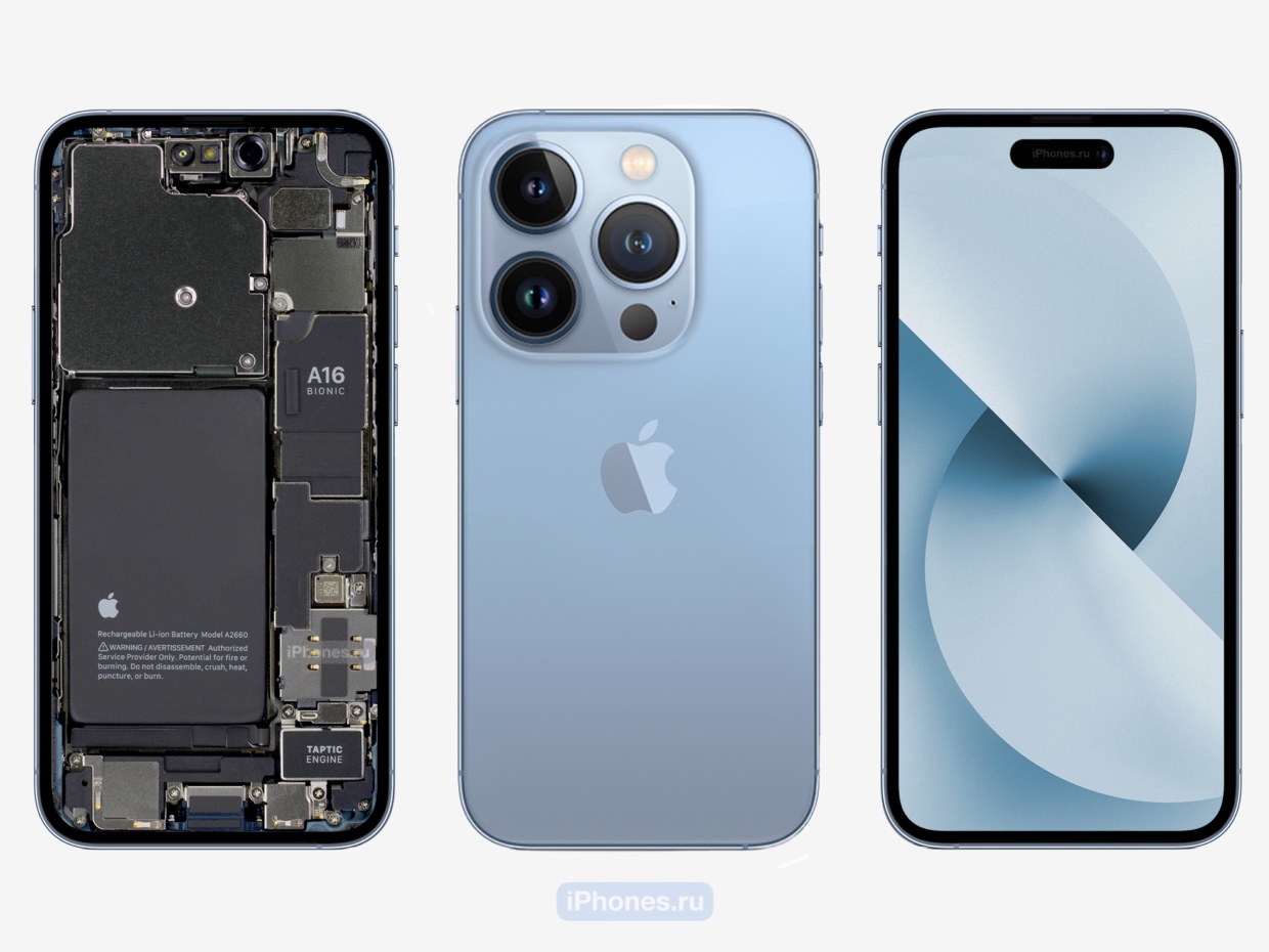
At first, we considered an option with a pop-up window on the right edge of the screen, where information about the time, the state of the cellular signal and Wi-Fi network, battery levels, brightness and volume is displayed. But this concept was still abandoned.
The second design version was black for the top part of the screen. It was assumed that in this way the notch could be hidden and made almost invisible on high-contrast OLED displays. And in this way it was possible to solve two problems at once: hiding the cutout for overall aesthetics and saving battery power, since thanks to this approach the charge consumption of unused pixels was reduced.
However, in the end, the choice was made in favor of Dynamic Island. This version of the user interface not only enabled information to be displayed in a window of a certain size, but also made it possible for this window to change in the context of a particular event.
Source: Ferra
I am a professional journalist and content creator with extensive experience writing for news websites. I currently work as an author at Gadget Onus, where I specialize in covering hot news topics. My written pieces have been published on some of the biggest media outlets around the world, including The Guardian and BBC News.

