


Over the past two months, iOS 18.0 beta insistedthe risks of bricking were gone, so after the release of the seventh update it was decided to update. I need to record videos for you with new strong people in our VK group, and I myself was already impatient to try the new personal settings options, the updated control center and the site cleaner in Safari.
The build works stably even on my three-year-old iPhone 13 Pro: there are almost no lags, animation slowdowns or bugs. But there are a lot of new things that I noticed immediately.
Below I will tell you about those really useful new features that I recommend you try. first of all. For their sake, you can confidently update in two weeks, when a stable build is released.
And at the end we will share the main pain iOS 18, which will make some people think twice and perhaps even postpone the transition to the new version of the operating system.
Text calculator in notes saves
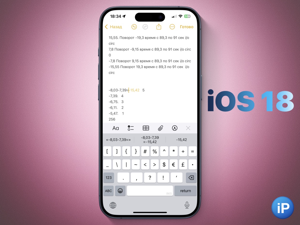
Apple staged its WWDC24 presentation in such a way that it seemed like the calculator was built exclusively into the iPad.
In fact, handwritten input expressions and calculations are fully integrated into iPhone notes.
I rarely write with my finger, but calculating the weight of food for calories, currency conversion, and budget expenditure is done constantly. Recently, I needed a correct calculation of animations, an example of this chaos is above. Without a built-in calculator, when the number is about a million, it would be difficult.
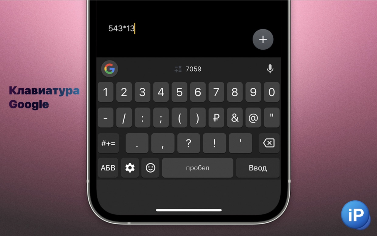
I used to need the built-in calculator on the keyboard so often, replacing the default Google keyboard for iPhone. But then I reverted back and found myself jumping back and forth between Notes and Spotlight/Search to do calculations.
Now there’s one less problem.
I’ve been using Google keyboard on iPhone for a month. Here are 5 of its mega-useful features, I use it every day
Personalized buttons in Control Center make life much easier

For as many years as the old Control Center on the iPhone has been with us, I have dreamed of being able to disable the useless button for broadcasting an image from it. Recall that the design was first changed during iOS 11, released in 2017.
Immediately after the update I started to customize the button for myself:
While Apple has mandated that you can now have multiple pages in the app again (one custom, one for music, one with buttons for communication), you can delete the whole thing and return to one page, as it was before. Not only is this easier, but it also brings back the swipe gesture anywhere to close the control center. Otherwise, you have to close it as an app using the bottom bars.
❗️Since it started with beta version 4, and now on beta version 7, there are still bugs. Initially, it was not possible to add a Wi-Fi control button, this was fixed. Sometimes half of the buttons disappeared. Now the only problem left is after reboots, when the system for some reason continues the useless mirring function and deletes others.
Well, there are still some awkward transition buttons when rearranging. I hope they will fix it by the release.
Darkening wallpaper gives more flexibility
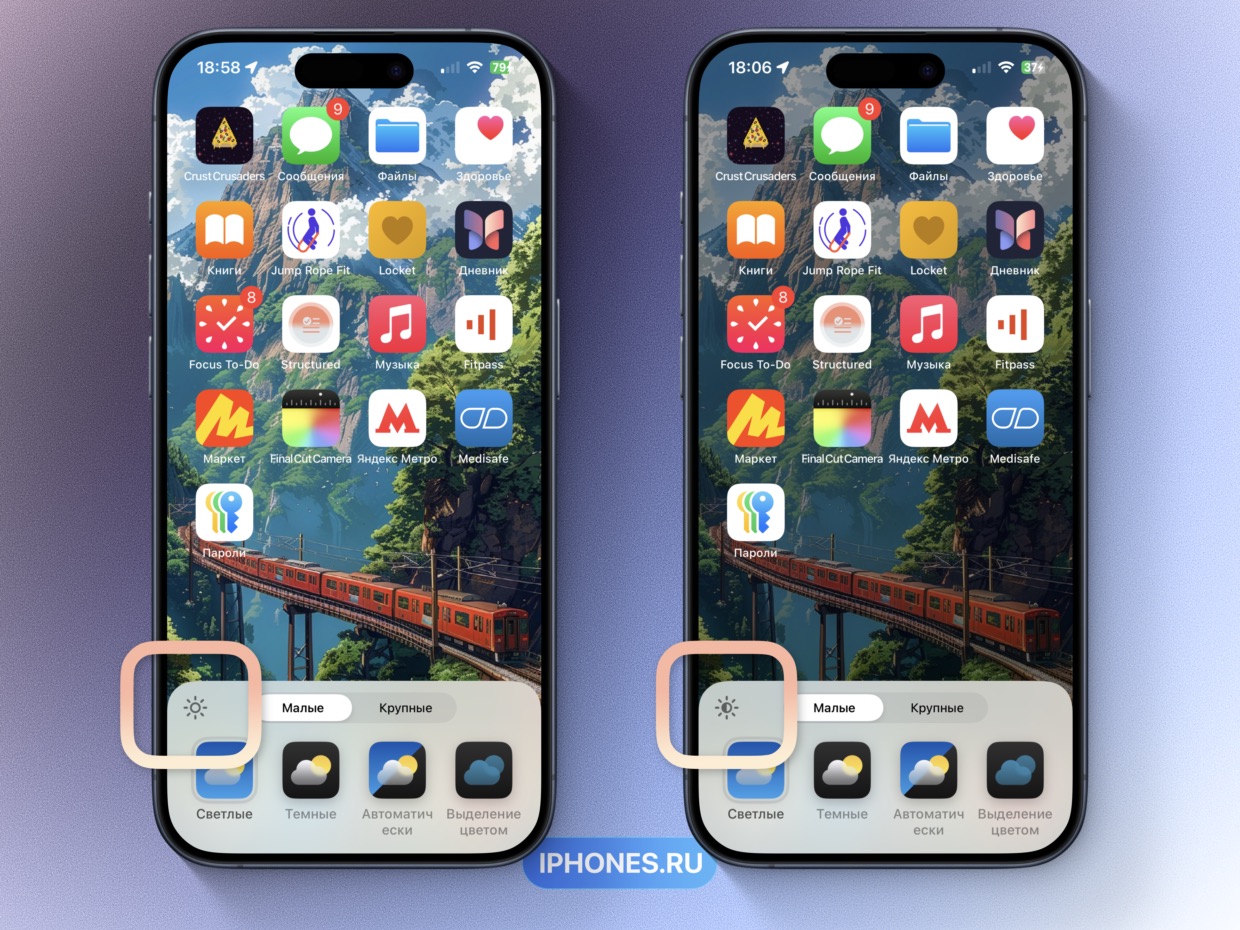
A dark background is not blinding and offers the best icons on contrasting wallpapers
It has long been known that in iOS 18 it will finally be possible to replace the round buttons on the screen lock. The feature is obvious, the desired one left the flashlight on the left, but replaced the camera with Shazam on the right.
But almost no one talks about another thing: customizing your iPhone for yourself.
In the icon change mode, you can then change the background image. The previous system did this automatically in the Sleep focus and in a slightly darker mode. You could also manually set it when creating a new focus, but now there is an option right at your fingertips.
First of all, it is useful when you have bright wallpapers. In the lock mode they do not change, and on the home screen, which you see much more often, it becomes much more comfortable to view.
The updated markup tool has become obedient
In my review of the iPad Pro 11 on M4, I paid attention to the excellent digital whiteboard app Freeform. It helps you quickly sketch out diagrams, make storyboards, and organize task planning.
Not everyone likes it, but for me, one of the strong points of the program is the convenient management of figures and text. They are easy to add, quickly change the size, color, proportions.
Many of these features now appear in Markup mode on the iPhone, when you take a screenshot and want to add something to it. Next to the object you’re formatting, a floating context menu with quick settings now appears, responsive and logical, instead of the old, unruly one.
The function is useful when you need to quickly insert an arrow of the required size, discreetly paint over personal information, add text. It’s just a pity that the magnifying glass was never returned.
But a new mega-feature has appeared, which will be a saving surprise for many.
Anti-motion sickness protection in cars works like magic
I didn’t know that some movements on the screen dots help me to love personal transport again. Since I was 15 I have avoided cars whenever possible because I get motion sickness both with and without the display.
In the phone from the device instantly, until the new universal access feature is tested. Nikita Goryainov I made something about anti-motion sickness for post selection, and I made a video instruction on how to enable it.
Here I will just mention once again how cool she is.
After the update, it is installed by default and runs when you provide a vehicle transport. Let me remind you that it is located on the path Settings > Universal access > Movement > Display vehicle tags.
Tested in the subway, taxi and plane. The points are not made immediately, about 3 minutes after you started driving. Responsiveness is complete, reacts to small changes in speed and sudden pauses/accelerations.
The most unexpected feeling of nausea passes almost instantly. It seems that Apple accidentally invented another way to tie us to the smartphone screen, because now I use this feature as a medicine, even when there is nothing to do on the smartphone.
The world suffers from this problem, but now it is solved. Turn on anti-motion sickness in iOS 18
Bonus: The Photos app makes me want to go back
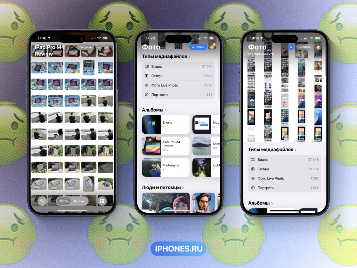
The Photos app redesign is clunky and awful. It has one plus – more utility folders like “Handwriting”, “Imported” and “Illustrations” were added, in which media files are sorted automatically.
All the other inconveniences turned into a chapter, I repeat the words of our Reda, a garbage dump.
▸ Photo folders are now displayed on the same screen as the main gallery, meaning you can’t switch to another media without dropping the entire view down.
▸ The folders themselves are grouped in such a way that they need to be scrolled through in a carousel, since they, in turn, are promoted by groups.
▸ Folders in each section now look different, there is no complex style. Some kind of mess.
▸ The newest photos are now on top and sometimes reopen in the header of the folders they are in.
All in all single tape It looks like a dumping ground for everything that was previously neatly sorted into sections.
And here I have the biggest complaint about the use. The missing strip with sections Apple itself recommends the adapter to all developers, and not without reason.
Previously, it was convenient to search for photos in chronological order on one feed, and then go to the folders section without losing progress and move them to the desired album in the order I want, and then go to the chronological feed and continue searching for the desired shots.
It was very well done when I was thinking about photo posts like this, when I had to operate with hundreds of shots at once. Now it’s impossible.
That is instead of asking for a split screen for two apps after 10 years, Apple removed even the beginnings of it for me, which at least somehow caused a productive solution to the problem for file management.
iOS 18 will be released in early September, and there are rumors that there will be no new beta versions released.
They managed to fix something, but Photos need to be seriously redone. After the release of iPhone 16, I learned and listened to Apple.
In the meantime, you can check out our expectations for iOS 18 with what actually happened.
What features are missing from the iPhone right now. Forget AI, we still haven’t got the rooms
Source: Iphones RU
I am a professional journalist and content creator with extensive experience writing for news websites. I currently work as an author at Gadget Onus, where I specialize in covering hot news topics. My written pieces have been published on some of the biggest media outlets around the world, including The Guardian and BBC News.

: Everything we know a week after its release")


