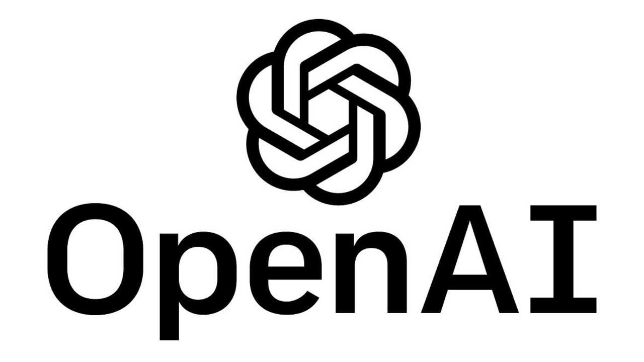
Employees described the new logo as “lacking in creativity” and even “ominous,” a stark contrast to the current design, which is intended to represent “certainty, potential, and optimism.”
The redesign initiative reportedly began a year ago and was driven by OpenAI’s need to create a more robust brand identity as it “gains social acceptance.” One reason for the changes is that the company doesn’t have the fonts used in its current branding.
In addition to changing its logo, OpenAI is also restructuring its corporate model. CEO Sam Altman told employees that the company plans to shift from its nonprofit roots to a more traditional for-profit structure.
Source: Ferra
I am a professional journalist and content creator with extensive experience writing for news websites. I currently work as an author at Gadget Onus, where I specialize in covering hot news topics. My written pieces have been published on some of the biggest media outlets around the world, including The Guardian and BBC News.


