


")


Everything is changing. The once “wall”, now a group of the largest social networks in Russia, will from this day improve in accordance with the times and the needs of its hundreds of millions of users.
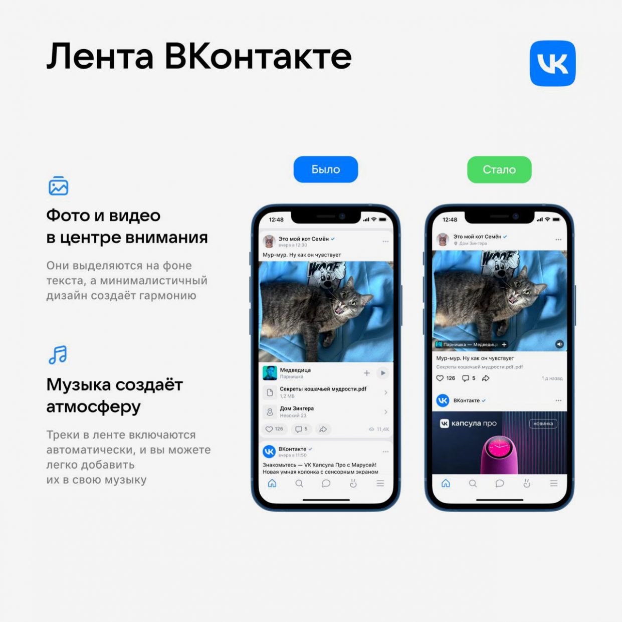
Interface appearance it will become much easierposts are larger and more visible, it will become easier for authors and communities to attract attention to each publication.
The VKontakte team gave us early access to the new feed and shared what a large-scale redesign of the most widespread part of the social network is worth.
How the VKontakte feed has changed today
VKontakte today, December 5, presents an updated design of the main feed, post editor and other functions for posting and interacting with content.
The new design includes immersive content, a minimalistic interface and simple navigation. All in order to improve visual perception and help users more easily find interesting authors.
Before updating VKontakte, a detailed testing phase was carried out. The results showed an increase in subscriptions to the community from the feed by 16% and improving user software in the content. The new feed design allows you to create posts that better focus users’ attention and stimulate interaction with your audience.
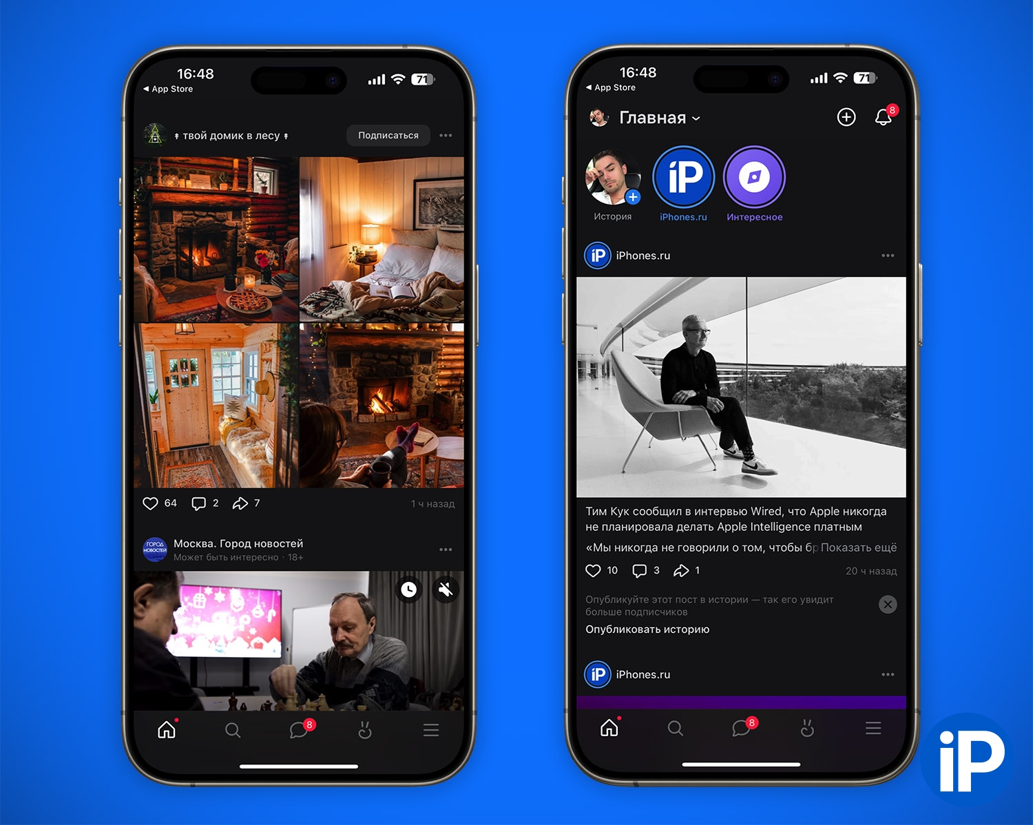
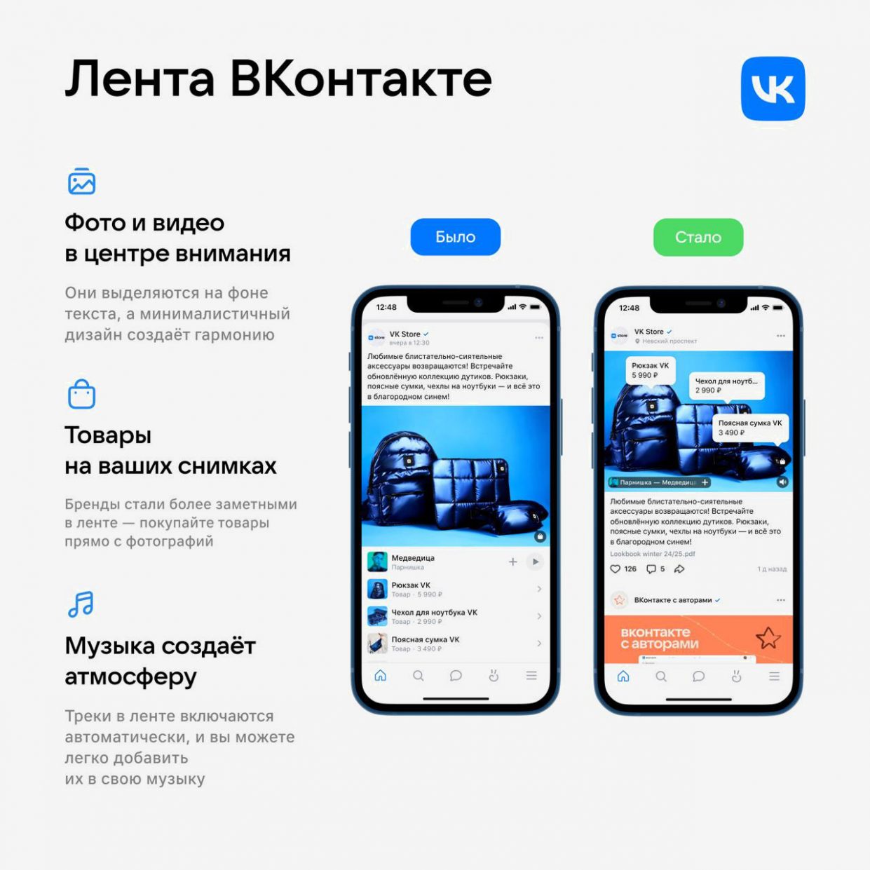
New VKontakte feed in the application, a minimum of unnecessary things.
When you also have access to the new feed, you (like me) will immediately notice that it has finally become visually “cleaner” and easier to perceive. There are significantly fewer interface elements, and those that remain are not as noticeable as before.
This image or video is much larger than in the previous version of the VKontakte feed. The accompanying text was not removed anywhere, its scale simply changed in the context of the media content of the post.
In the mobile version, now the media content always comes first when scrolling, and then the text. This all reminded me of how the Reddit feed works. As an active user in both senses, these changes seem quite logical.
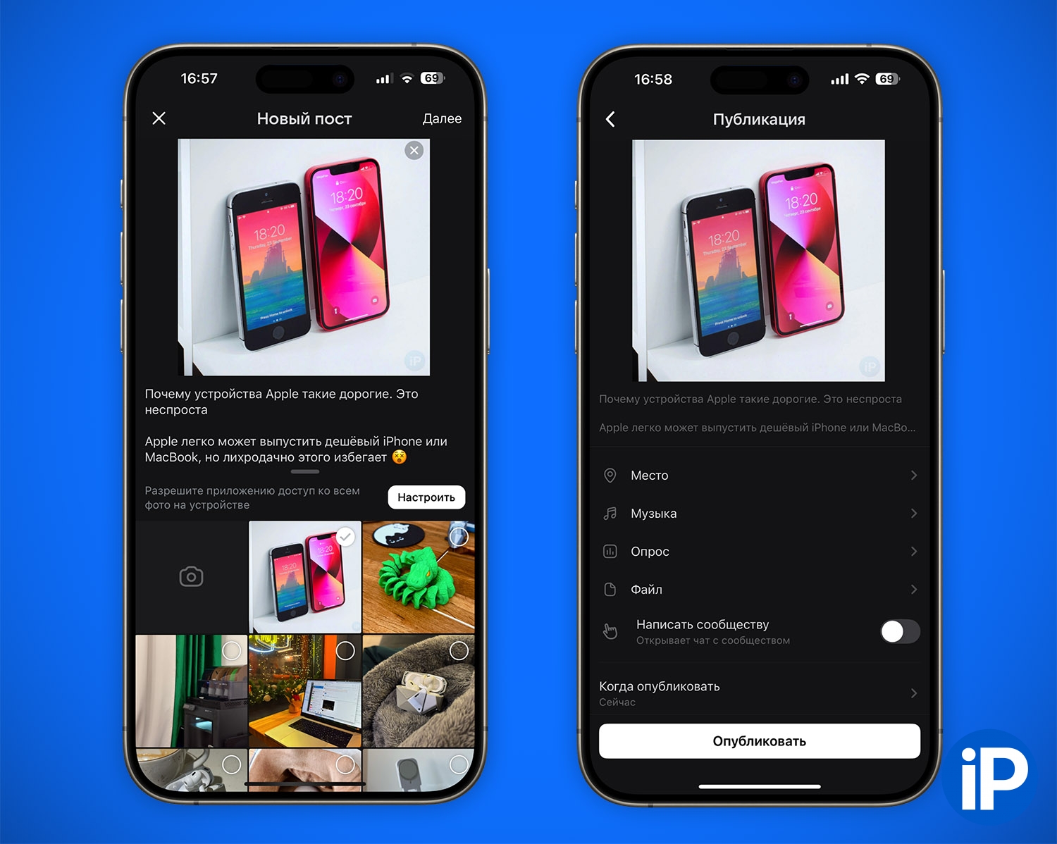
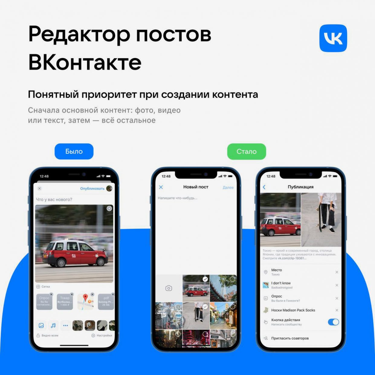
New interface for creating a VKontakte publication.
also changed post creation screen. achieve greater emphasis on added media to posts – be it a picture, video or music. The very logic of compiling the publication has changed. On the first screen you can add a photo or video, as well as text. And only then everything else: a geotag, a music track, a link to a product, and the like.
As the VKontakte team explained, photographs, clips and videos help attract more user attention to the publication.
❝
The new feed design is more than just a visual update. We conducted a complex of large-scale research, studying users, authors and businesses on the platform. Our audience is interested in quick access to media content, without external navigation and heavy interfaces.
Thanks to long-term testing, we carefully analyzed user responses, feedback from authors, and developed a design taking into account the transformation of social networks into open platforms. It allows original content creators to increase engagement through media formats that are widely sought after by audiences.
— Product Director at VKontakte Evgeniy Vasilyev
Why redesigning the VKontakte feed is a trend
The feed is a key element of VKontakte, and updating is part of the social network’s strategy for constant user experience.
VKontakte abandons redundant interface elements and visual noise to help the user. focus on what’s really important: information and content. Unlike in previous years, when social networks began to offer more tools and features, now everyone is paying attention to navigation and focusing on content.
Over the past 10 years, everything on the Internet has been moving towards simplification and continuous improvement in functionality. The updated VKontakte feed is an example of this global trend in design and UI/UX. It mixed the demands of users, the need to compete with alternative platforms, and the tasks of authors generating the content themselves. This transition resulted in a flexible and adaptive approach.
Today’s update of the social network continues VKontakte’s line of permanent navigation and interface, starting with updating the navigation and bottom menu that was presented earlier. They prefer to use sections according to personal priorities and interests, which contributes to the quality and accuracy of recommendation algorithms.
Want to see for yourself what has changed? The mobile application will updated in recent daysweb version – in a few weeks. So if you use VKontakte regularly, you will soon be able to evaluate both the new feed and the new editor for yourself.
Source: Iphones RU
I am a professional journalist and content creator with extensive experience writing for news websites. I currently work as an author at Gadget Onus, where I specialize in covering hot news topics. My written pieces have been published on some of the biggest media outlets around the world, including The Guardian and BBC News.


: Everything we know a week after its release")


