


Climate change is the greatest threat facing humanity today. Although we have studied forms of planetary defense against dangers from space, such as the DART mission, the climate crisis is much more tangible and close at hand. To see it better, NASA is providing you with its climate time machine, and you can use it right now.
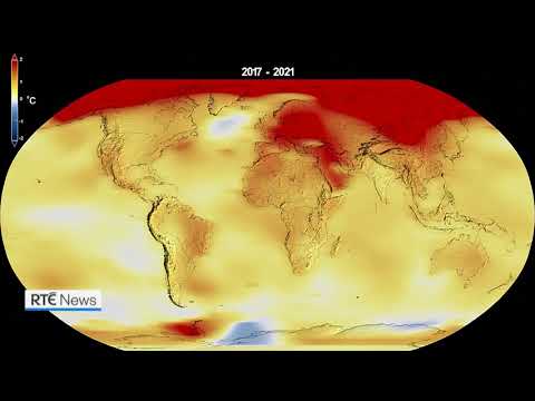
This timeline provided by NASA shows us climate change since 1884. From now on, we can gradually move forward year after year until 2021. It is in this year that the data published by the space agency ends, as well as demonstrate a serious increase in the average temperature of the planet.
But that’s not all NASA’s climate time machine is capable of. It also allows us to look at other equally important indicators, such as rising sea levels, shrinking permafrost in the Arctic seas, and levels of carbon dioxide in the atmosphere.
NASA lets us see the damage from climate change on the planet

Despite all the IPCC climate warnings since the 1990s, carbon emissions have increased over the years. In fact, they did it very abruptly, reaching historic levels today.
As a result, scientists believe that global temperature may exceed the limit of 1.5 degrees Celsius established by the Paris Treaty in 2015. So much so that it could rise to 3.2 degrees Celsius by the end of this century.
While a couple more degrees doesn’t sound like much of a problem, an increase in the global average temperature, however small, is extremely dangerous. For comparison, in 536, classified as the “worst year in history”, the average temperature in Europe fell by 2.5 degrees Celsius due to a volcanic winter caused by the eruption.
As a result, there were mass deaths around the world, due to the death of most cultures. In addition, the subsequent increase in sea ice cover and the minimum amount of sunlight due to the volcanic winter caused global cooling for more than a century.
Needless to say, in addition to deaths from diseases caused by malnutrition and lack of vitamin D, wars for resources became more and more pronounced. Thus, humanity as a whole is faced with one of the darkest and most dangerous periods of its history. Today we are going to repeat it.
The rise of the oceans and the collapse of Greenland
Another graph, available on NASA’s Climate Time Machine, gives us a glimpse of the rise of the world’s oceans. With the help of a map, we can see which areas of the world will disappear as sea levels gradually rise. In particular, the map is dedicated to southwestern United States, northern Europe, the Amazon Delta and Southeast Asia.
The result of sea level rise will be devastating. Cities like Amsterdam, Miami and New Orleans will completely disappear. Others, such as London, Kuala Lumpur and Norwich, will be in serious danger.
For this, for its part, the melting in Greenland must become more acute (which is not far off). One of the maps shows NASA’s climate time machine. let’s look at the deterioration of this area of eternal ice since the 1970s.
Fortunately, the fight against climate change continues and is gaining momentum. This November, Egypt will host a UN summit to discuss issues related to climate change, a phenomenon that is even more affecting the world’s poorest countries.
Source: Hiper Textual


: Everything we know a week after its release")


