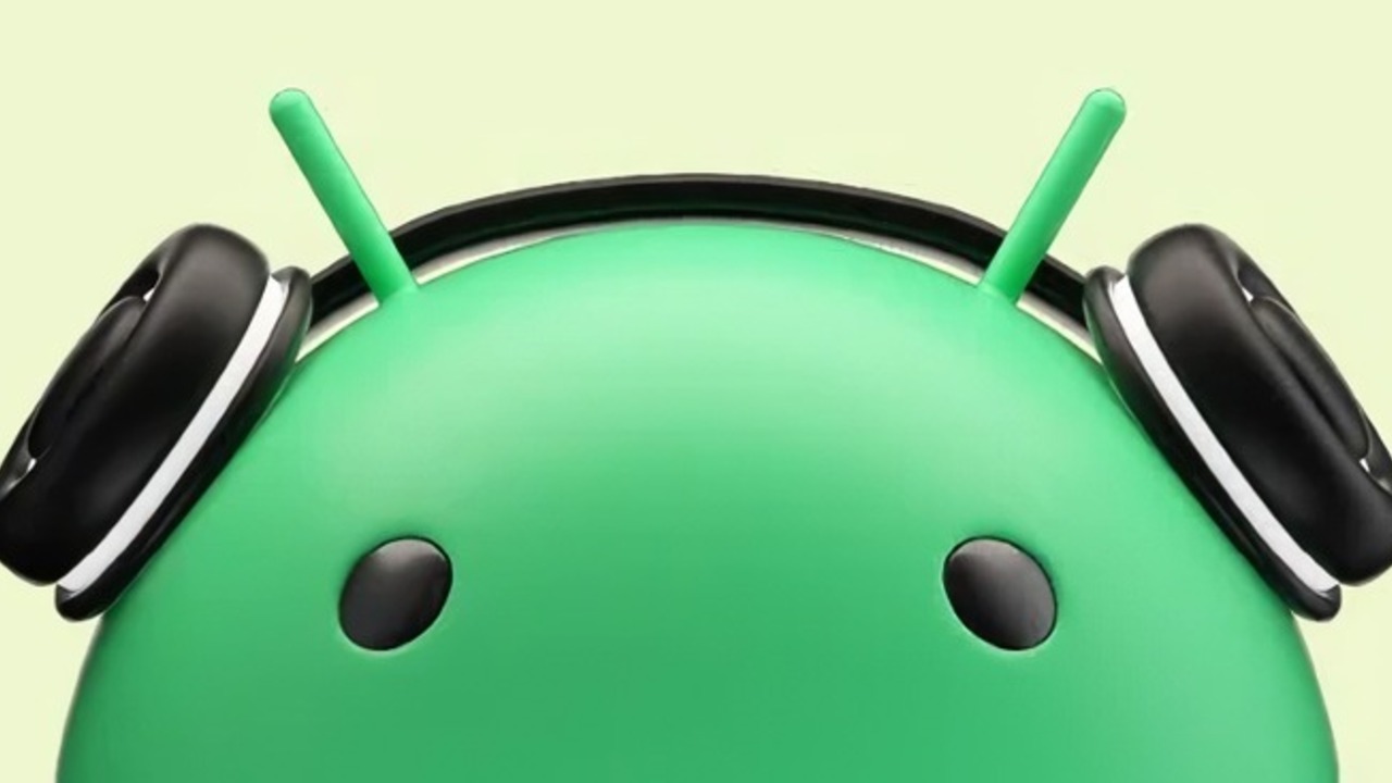
The new Android logo will keep the general design of the previous version, while ditching the flat shapes in favor of a more realistic 3D style.
The new logo uses a matte texture to give it a more modern look. Also noteworthy is the change in the spelling of the word “Android”, in which the lowercase “a” is replaced with a capital one.
Google representatives called this update “new corporate identity” for the mobile operating system. They did not reveal the exact date of the official rollout of this update and other possible changes.
Given that Google has been ramping up its interest in the 3D logo for several months now, we can assume that more information will become available with the release of Android 14.
Source: Ferra
I am a professional journalist and content creator with extensive experience writing for news websites. I currently work as an author at Gadget Onus, where I specialize in covering hot news topics. My written pieces have been published on some of the biggest media outlets around the world, including The Guardian and BBC News.


