
")


The Banki.ru financial market has been remodeled. The update symbolizes a new stage in the development of the platform, giving users access to expanded financial services and opportunities – augmented financial reality.
Subscribe to RB.RU on Telegram
The Banki.ru logo was developed almost 20 years ago (the project was launched in March 2005) and has practically not changed since then. It was a logo combined with the Latin brand name banki.ru, the subtitle “information portal” and a three-color icon in the form of a bar graph. The brand symbolized the rating of banks, because initially Banki.ru was a database of Moscow banks and deposits, as well as a banking news service.
Currently, Banki.ru is number one among Russia’s financial markets in terms of traffic, according to Similarweb. Banki.ru has grown from an aggregator and information portal to become one of the largest fintech companies in the country. The logo, familiar to many, did not reflect the new brand positioning or mission of the financial market, but rather responded to the requests of the aggregator and the rating agency.
To change the visual concept of the Banki.ru brand, a strategic study was carried out, which included an analysis of the company, the market, trends, as well as interviews with target audience segments. The restyling affected not only the logo, but also the color combination to give the platform a modern and more digital look.
The new Banki.ru logo consists of an icon and the brand name. The name is now in Cyrillic and the icon in the logo has become more concise, depicting a stylized crescent graphic of six quadruple circles.
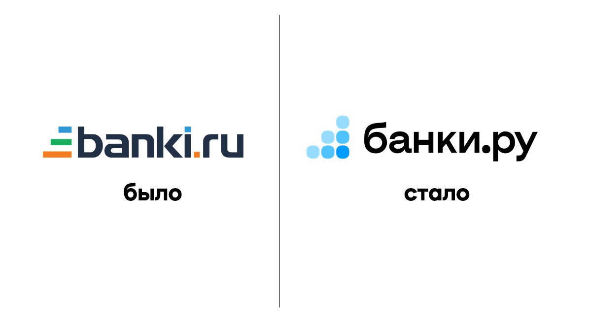
The number of colors on the poster was reduced to one: the company abandoned orange and green. The color blue, according to users, is more associated with the financial sector and digital services than others. The company made the decision to choose a logo with the help of its users: more than 1,500 people helped Banki.ru choose.
The brand name in the logo now symbolizes not the rating of banks, but the entire range of financial solutions and products. There is growth and stability in it, while the number of elements has increased and multiplicity has appeared. Due to the gradation of tones, spatiality also appears on the sign, which conveys a new visual concept of the brand: Banki.ru, augmented financial reality.
Banki.ru’s corporate style adapts to modern trends and tastes of the target audience. The new visual identity is designed to highlight a modern and innovative approach in the provision of financial information and services, making the process of communicating with the platform more comfortable and convenient for users.
Author:
Irina Pecherskaya
Source: RB
I am a professional journalist and content creator with extensive experience writing for news websites. I currently work as an author at Gadget Onus, where I specialize in covering hot news topics. My written pieces have been published on some of the biggest media outlets around the world, including The Guardian and BBC News.


: Everything we know a week after its release")


