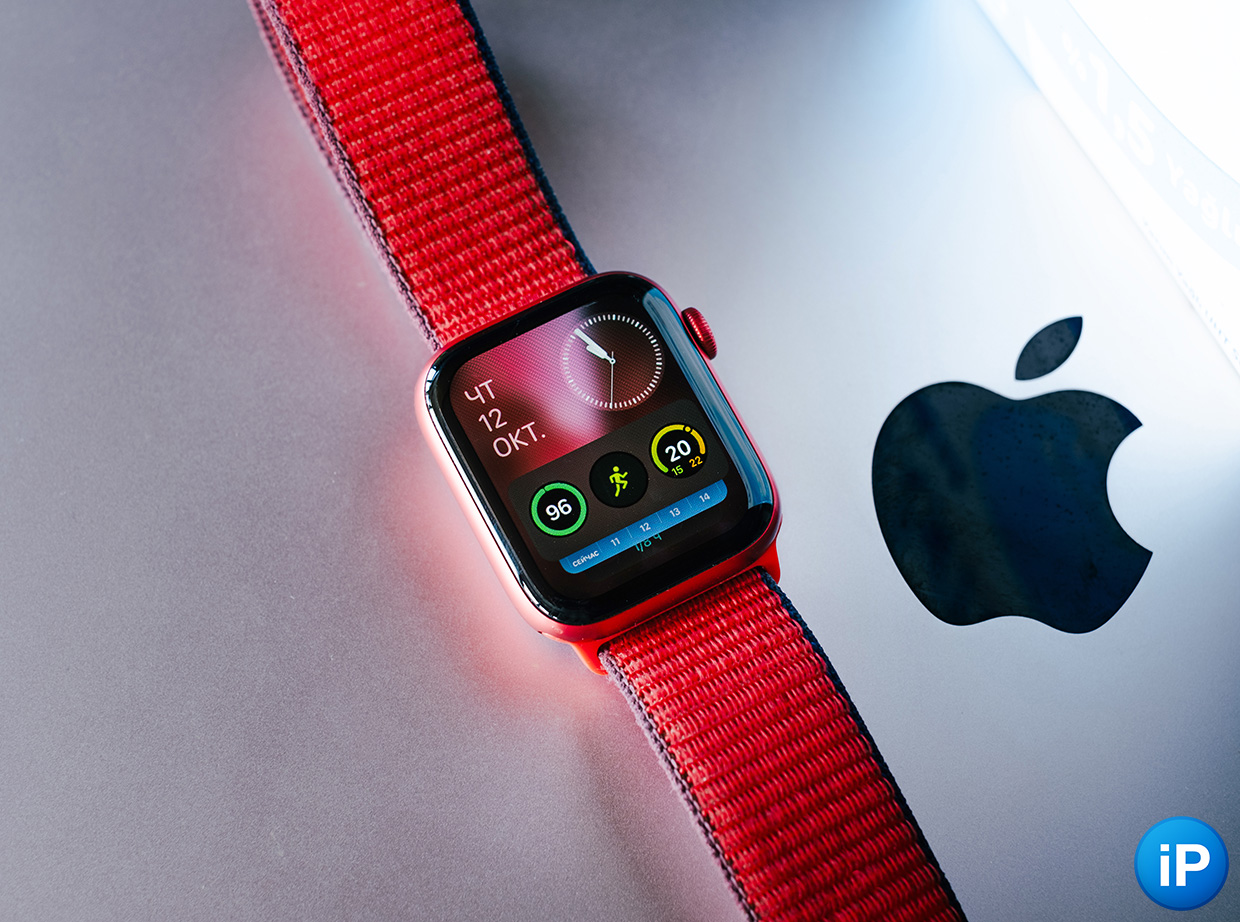
I’ve been using my Apple Watch Series 6 for two and a half years, and with each update it has blossomed in functionality.
Last year’s watchOS 9 added expanded features for runners, sleep tracking, and a new style of push notifications.
But cosmetic lift I asked for a long time. With the release of watchOS 10, the watch looks noticeably fresher.
The only problem is that Due to the release of the new OS, using the Apple Watch has become inconvenient.
I collected 5 points that, in my opinion, made the device worse.
1. You can no longer scroll through dials with one gesture.
It was a convenient opportunity.
Up until watchOS 9, changing the watch face was always a simple gesture: you just had to swipe your finger along the left or right edge in the opposite direction.
There is no more functionality. Now you need to hold your finger on the screen, wait for the selection menu, scroll through the watch faces and press the digital wheel or display to confirm.
And that’s not a problem.

On the device support page, only one of the two methods remains, although all available versions before watchOS 10 concern two ways to change the watch face.
Usually, at every stage, the motivation of Apple interface developers is clear to me. But here I can’t even guess approximately why this method of changing the appearance of the device was removed. The same questions are asked on the company’s website by other users.
There is one idea though. Apple wants to wrap our time screen on the watch?
2. Widgets are useless
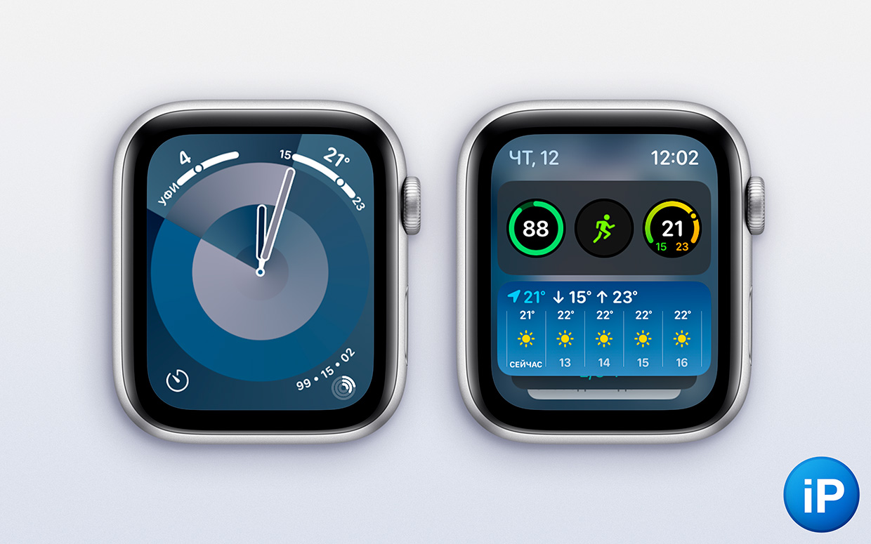
Apple chose a strong redesign and “optimized” control logic as the hit of the new watch OS.
Previously, swiping up gradually opened Command centre with focus, flashlight, charge status and so on.
The gesture now provides a menu of widgets with quick actions, weather, to-do list, and other extensions.
The idea is fresh, the product is pleasant, the need… is dubious.
In my opinion, modern watch faces with a rich variety of extensions already provide easy access to any information.
The new menu is needed only for dials where there is nothing except time. But in this case, I usually swiped one screen to the right, where there was a dial with data placed in the corners, and received all the infographics.
Accessing widgets looks convenient only in theory. In fact, holding your hand up for more than ten seconds is inconvenient, so you can’t put many “cards” there, no matter how hard Apple pushes the feature.
In this case, we will try to make the watch more autonomous from the iPhone so that the user can look at the tiny screen longer in the new watchOS 10 without stopping.
3. You cannot change workout metrics from your iPhone.
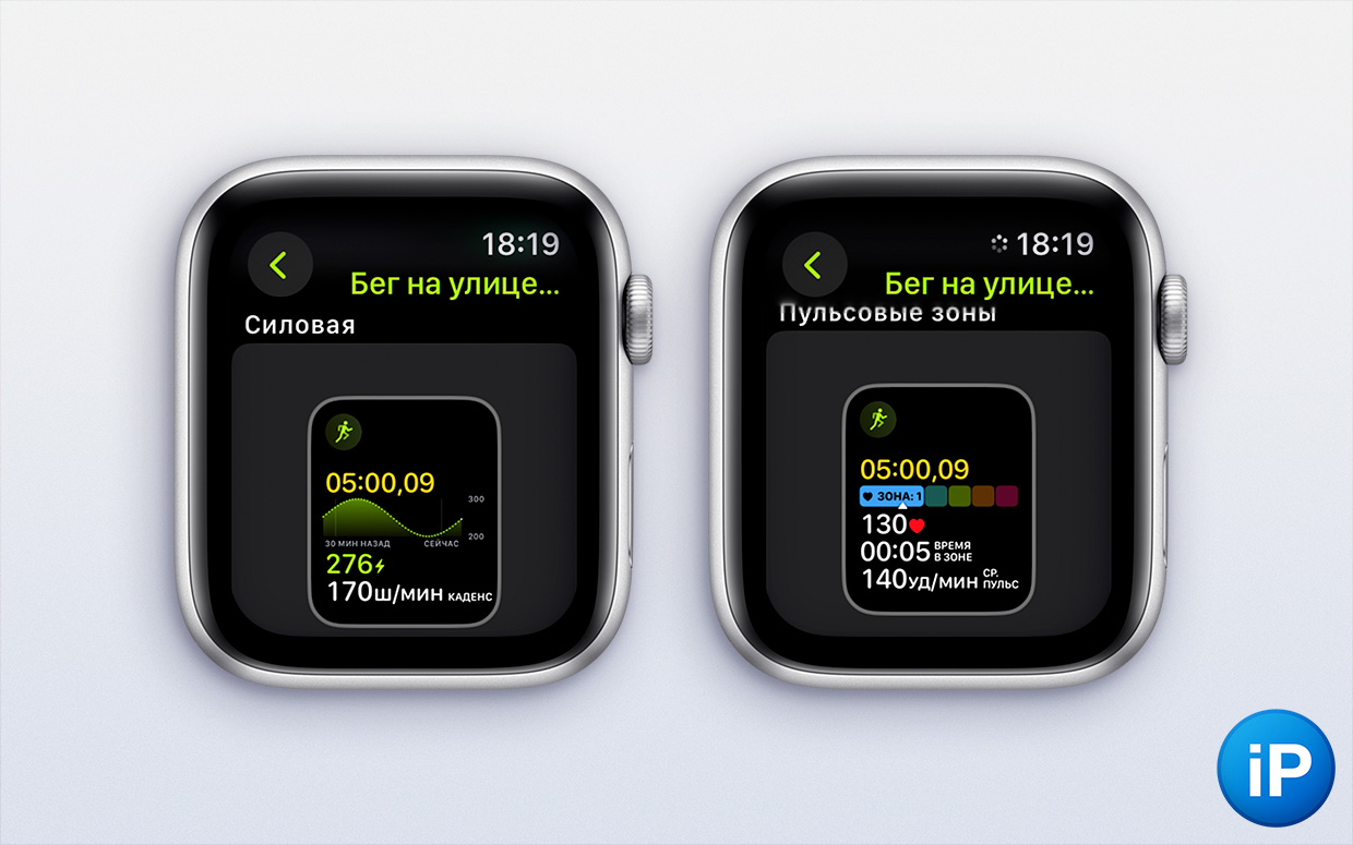
Instead of making it easier to manage your watch, the developers ignored a problem that appeared in watchOS 9.
Application Workout is the heart of the company’s watches. Apple often visits its laboratories, where engineers study swimmers, runners, yoga masters and other athletes.
There are precise algorithms and convenient infographics, which are also flexible in terms of harm.
But in watchOS 9, choose which Google metrics during your workout you could use on your smartphone.

Application – heavyweight The watch does not give the main thing – setting up the watch as a thin sports instrument
For example, while running it is important for me to see current tempo, pals, distance traveled. I do not need power, length or step height and so on.
Previously, you could set all this up in the Watch app on your iPhone. Now you can only on the clock with a bent arm suspended. Fiddling with such a large list through a small screen on the sofa.
Moreover, workouts on Apple Watch are different. Even if you regularly do five types of activities, you don’t want to spend hours customizing each of them.
In addition, on the big screen the company could give belts to the metrics why functions from functions are needed.
But all this data is clearly displayed. Unlike the other important element.
4. The item is less readable, for people with glasses this is a disaster
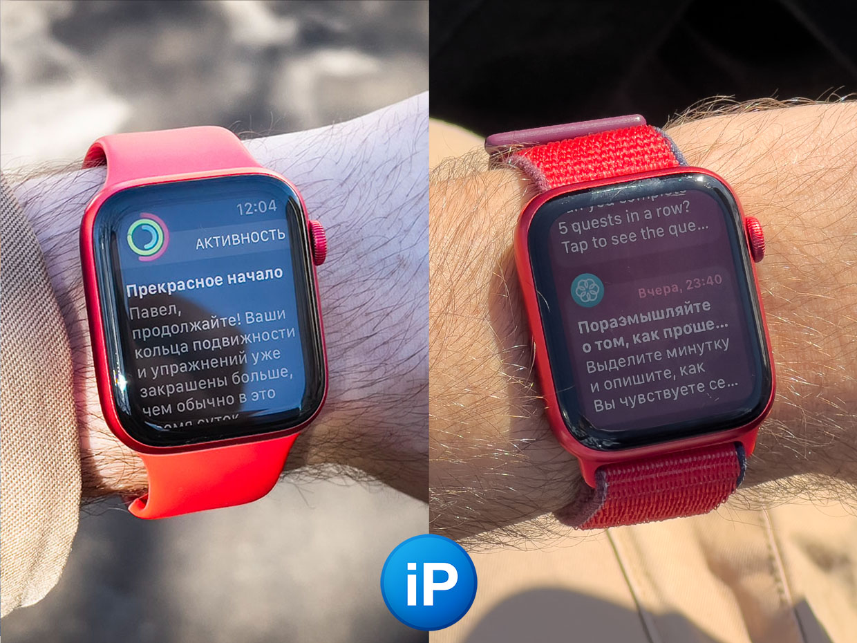
Left watchOS 9, right watchOS 10
The new OS introduced transparency effects with overlay on the background, like in iOS.
Previously, notifications and many applications were displayed on a black background.
Now they are superimposed on the frosted glass, the surface of the heavily blurred dial, which serves as a pretty backdrop. It looks fresh, but readability has dropped dramatically.
No matter how confidently Apple increases the diagonal of its watches, their displays are still small.
I have glasses -6, the lenses in them are reduced. The Apple Watch Series 6 44mm screen looks smaller than the 40mm models for people without correction. For the same reason, I never bought 13‑inch MacBooks, which feel like 11‑inch ones, I only chose stock ones.
Therefore, to make the notifications easier to read, white text was written on a black background.
Apple makes a big deal about accessibility in its PR (deservedly so), but at this particular moment something went wrong.
Increasing the contrast on the watch does not help, I also did not find the “disable blurry dial in the background” function.
I hope they will fix this in the next updates.
5. The app gallery cannot be minimized for quick navigation.
Well, this was a completely unexpected change.
In watchOS 10, all app icons were displayed in either a loose honeycomb grid or a list view.
Although programmers installed a lot, I used a maximum of 10 pieces. I limited them all around the dial button and always knew what was on my left Workouton right Sleeping modeupstairs Pulseand here are three orange buttons for Timer, Stopwatch And Alarm clock.
With the update, the whole order was reset.
I like the new menu, and, fortunately, here, unlike the data in Workouts from point 3, you can change the position icon from the Watch application on the iPhone.
But the need to put things back in order again reminded me of who actually has absolute power on my phone.
With the update to watchOS 10, Apple showed that it can at will reset what I customized three years ago.
And he won’t ask.
Source: Iphones RU
I am a professional journalist and content creator with extensive experience writing for news websites. I currently work as an author at Gadget Onus, where I specialize in covering hot news topics. My written pieces have been published on some of the biggest media outlets around the world, including The Guardian and BBC News.


