


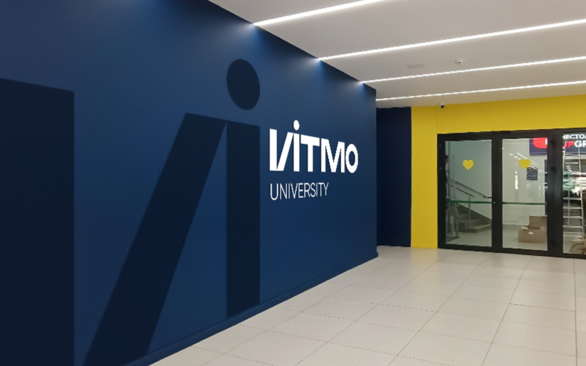
One of Russia’s leading universities has changed its name. Petersburg ITMO dropped “university” from its name and began to position itself as a scientific and technical corporation. The ITMO team participated in the development of the new corporate identity.
The logo contains new colors: black and white are used instead of the predominant blue. This will allow you to combine it with any shade from the palette, depending on the purpose of use, the ITMO press service explained.
It was:
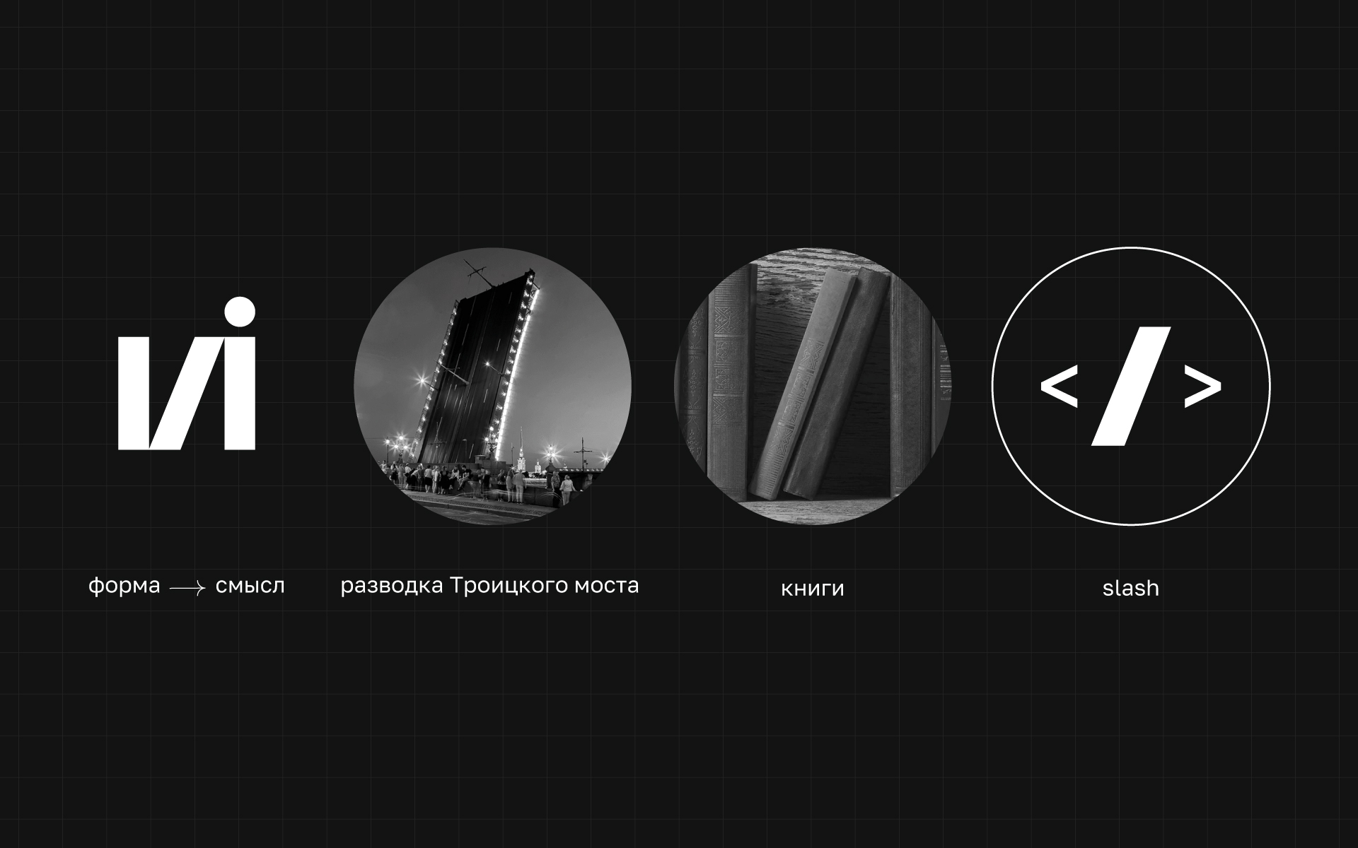
The letter “i” was given a separate meaning: it refers to images that are close to ITMO, for example, the drawing of bridges in St. Petersburg, the bar in the schedule, and the bookshelf. Also, ITMO removed the word “university” from the logo.
He turned:
“ITMO really goes beyond the classic university. The nature of the spirit changes brings us closer to a modern IT corporation, bringing together an entire ecosystem of completely different products,” said Kirill Alexandrov, Head of ITMO Strategic Communications Department.
The new corporate identity was developed by the ITMO team, which took six months to create. The university emphasized that the rebranding was carried out without the involvement of outside agencies.
Author:
Kirill Bilyk
Source: RB
I am Bret Jackson, a professional journalist and author for Gadget Onus, where I specialize in writing about the gaming industry. With over 6 years of experience in my field, I have built up an extensive portfolio that ranges from reviews to interviews with top figures within the industry. My work has been featured on various news sites, providing readers with insightful analysis regarding the current state of gaming culture.
: Everything we know a week after its release")


